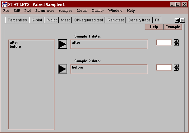
This statlet compares two columns of data, where the data in each row represent a set of paired samples. It does so by calculating statistics for the paired differences, i.e., the differences between each pair of values. This is in contrast to the Analyze - Two Independent Samples statlet which compares two columns of unpaired data. This statlet also performs hypothesis tests and constructs various graphs. The tabs are:
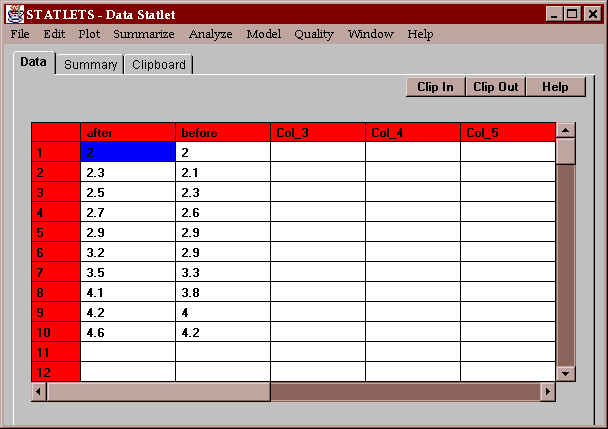
The sample data consist of measurements made on a set of 10 subjects before and after a drug was administered:
The primary question of interest is whether administration of the drug caused a significant change in the measurement.
The input panel requires the names of two columns of numeric data:
Any row with valid numeric data in both columns will become part of the analysis.
This tab produces a table of numerical statistics for the paired differences between column 1 and column 2:
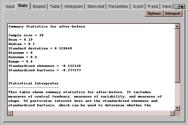
In this case, there are 10 differences. The mean difference equals 0.19, with a standard deviation of 0.129.
For a discussion of other summary statistics, refer to the One Variable Analysis statlet.
The Options button permits you to select any of 18 different statistics to compute:
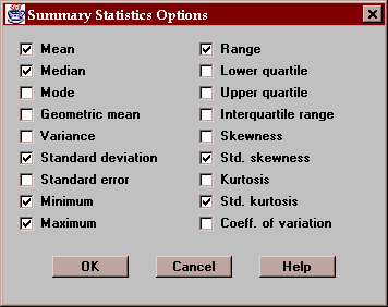
For definitions of each of these statistics, refer to the Glossary.
This tab displays a box-and-whisker plot for the paired differences:
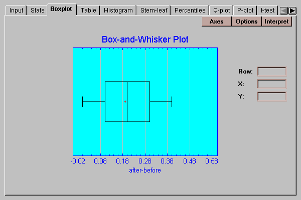
Box-and-whisker plots are useful graphs for displaying many aspects of a sample of numeric data. Their construction is discussed in the One Variable Analysis statlet.
The Options button permits you to control various aspects of the plot:
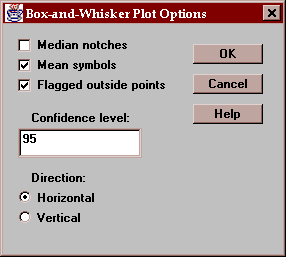
These include:
Median notches - if checked, notches are added to the box indicating the location of a confidence interval for the median difference.
Mean symbols - if checked, the location of the sample mean difference is shown as a plus sign.
Flagged outside points - if checked, the whiskers extend outward to the most extreme points which are not outside points. All outside points are marked with special symbols. If not checked, the whiskers extend outward to the minimum and maximum differences in the sample.
Confidence level - specifies the confidence level for the median notch.
Direction - specifies the orientation of the plot.
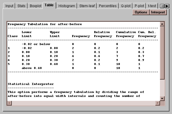
A traditional method for displaying the distribution of a set of data is to divide the range of the data into a selected number of non-overlapping intervals and to count the number of observations which fall within each of the intervals. This tab displays a table showing the results of such a tabulation for the paired differences:
The default number of classes will be determined using Sturges' rule:
k = ceiling[1 + 3.322*log10(n)]
where n equals the size of the smaller sample. The number and definition of the classes may be changed by pressing the Options button.
The four rightmost columns in the table show the results of the tabulation:
Frequency - the number of differences which fall within each interval. To be within the interval, a value must be greater than the lower limit and less than or equal to the upper limit.
Relative Frequency - the proportion of values within each interval.
Cumulative Frequency - the number of differences in each interval or previous intervals.
Cumulative Relative Frequency - the proportion of differences in each interval or previous intervals.
The Options button lets you specify how the intervals are defined:
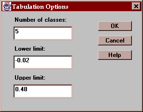
The fields are:
Number of classes - the number of intervals into which the data will be divided.
Lower limit - the lower limit of the first class.
Upper limit - the upper limit of the last class.
This tab creates a frequency histogram with bars of height equal to the number of paired differences in a set of non-overlapping intervals:
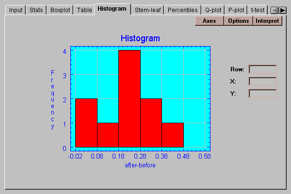
The intervals are the same as those in the frequency table described above and may be changed by pressing the Options button.
The Options button lets you specify how the intervals are defined:
The fields are:
Number of classes - the number of intervals into which the data will be divided.
Lower limit - the lower limit of the first class.
Upper limit - the upper limit of the last class.
This tab shows a stem-leaf display for the paired differences:
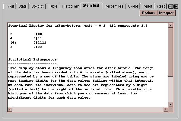
Stem-leaf displays are described in the One Variable Analysis statlet.
Use the Options button to indicate whether you wish outside points to be placed on separate stems or included in the main body of the display:
This tab displays percentiles for the paired differences:
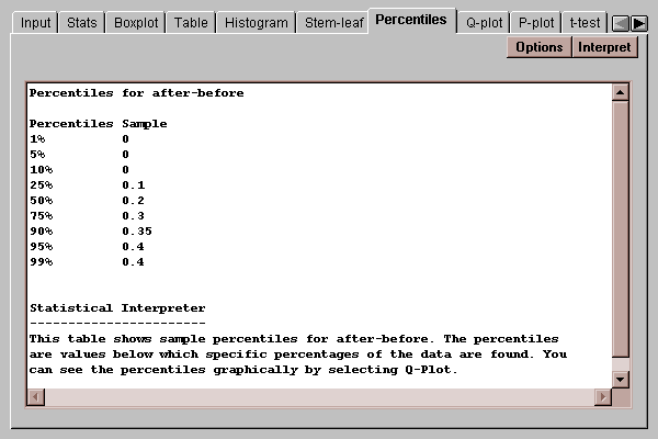
By default, percentiles are computed at 9 typical percentages, although this may be changed by pressing the Options button.
Use the Options below to indicate the percentages at which you wish percentiles to be computed:
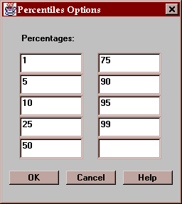
All numbers entered must be greater than 0 and less than 100.
This tab creates a quantile plot for the paired differences:
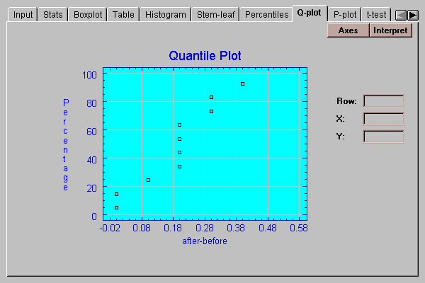
On this plot, the differences are plotted in sorted order along the horizontal axis. The vertical positions shown are (i-0.5)/(n+0.25), for i=1, 2, …, n. If the data come from a normal distribution, the points should show an S-shaped pattern.
A graphical check of the normality of the paired differences can be made by selecting the P-plot tab:
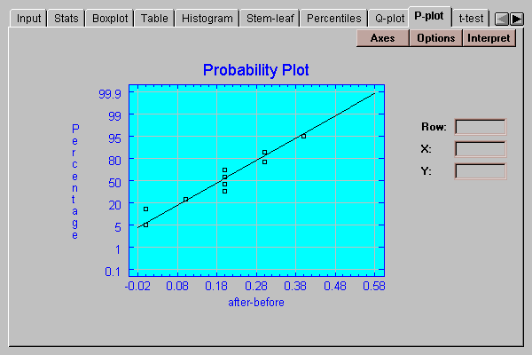
This plot is similar to the quantile plot, except that the vertical axis is scaled in such a way that if the data come from a normal distribution, the points will plot approximately along a straight line. The ordered observations are plotted at vertical locations defined by 100*(i-.375)/(n+0.25). A line has been superimposed on the plot corresponding to a normal distribution with the same mean and same standard deviation as the data.
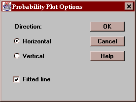
The Options button determines the orientation of the plot and whether or not a line is superimposed on the points:
This tab computes confidence intervals and hypothesis tests for the mean paired difference:
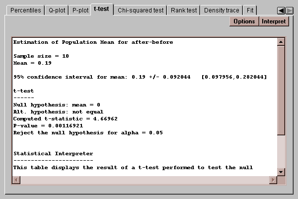
The mean paired difference delta equals the difference between the means of the populations from which the two samples come.
The top half of the output shows a confidence interval for the mean difference. The bottom half shows the results of t-test run to test the hypotheses:
H0: delta = 0
HA: delta ~= 0
Since the P-value for the test is less than 0.05, we can reject the null hypothesis at the 5% significance level, concluding that the true mean difference is somewhere between 0.10 and 0.28.
Use this button to specify the test to be performed:
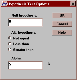
Enter:
Null hypothesis - the value of the mean difference specified by the null hypothesis.
Alt. Hypothesis - select a two-sided test (~=) or a one-sided test.
Alpha - the probability of a Type I error, which is a situation where a true null hypothesis is incorrectly rejected. Typical values for alpha are 10%, 5%, and 1%. The confidence interval is also affected by this setting and uses a confidence level equal to (100-alpha)%.
This tab calculates confidence intervals and tests for the standard deviation of the pairwise differences:
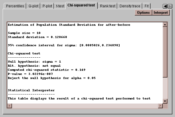
The confidence interval indicates that the population standard deviation lies between 0.089 and 0.235. The chi-squared test considers the following competing hypotheses:
H0: sigma = 1
HA: sigma ~= 1
It computes a test statistic according to the equation
chi-squared = (n-1)s2/sigma02
where sigma0 is the value of the standard deviation specified by the null hypothesis. Since the P-value associated with the test is less than 0.05, we can reject the null hypothesis at the 5% significance level.
Use this button to specify the test to be performed:

Enter:
Null hypothesis - the value of sigma specified by the null hypothesis.
Alt. Hypothesis - select a two-sided test (~=) or a one-sided test.
Alpha - the probability of a Type I error, which is a situation where a true null hypothesis is incorrectly rejected. Typical values for alpha are 10%, 5%, and 1%. The confidence interval is also affected by this setting and uses a confidence level equal to (100-alpha)%.
This tab conducts a test concerning the median of the population from which the paired differences came:
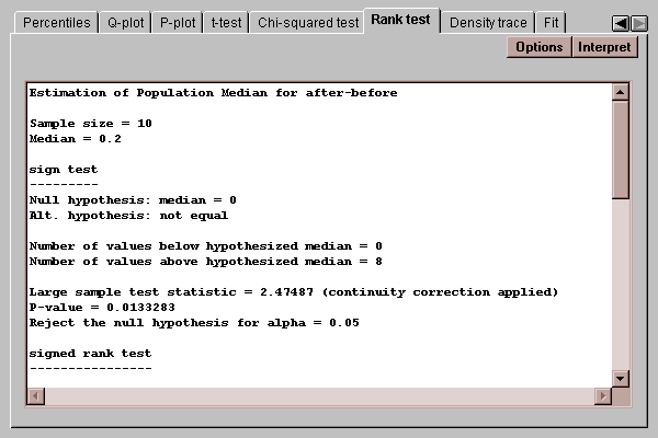
Two tests are performed:
A sign test, which counts the number of observations on either side of a hypothesized value for the median.
A signed rank test, which computes the distance of each point from the hypothesized median, ranks the absolute distances, and compares the average rank of observations below the hypothesized median to those above.
Of particular interest are the P-values for the tests. P-values below 0.05 lead to rejection of the hypothesized median at the 5% significance level.
Use this button to specify the test to be performed:
Enter:
Null hypothesis - the value of the median difference specified by the null hypothesis.
Alt. Hypothesis - select a two-sided test (~=) or a one-sided test.
Alpha - the probability of a Type I error, which is a situation where a true null hypothesis is incorrectly rejected. Typical values for alpha are 10%, 5%, and 1%.
This tab plots a density trace for the sample of paired differences:
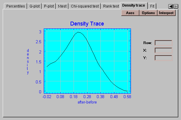
A density trace is produced by moving a window of selected width through the range of the data and counting (usually in a weighted manner) how many observations fall within the window at any selected value of X. It provides a nonparametric estimate of the density function from which the data sample came. The above trace, which was generated without making any assumptions about the underlying type of distribution, looks remarkably symmetric and bell-shaped.
Select the desired options for the density trace:
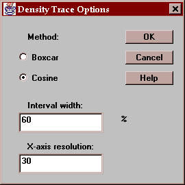
Indicate:
Method - the type of weighting function used when counting the observations within the window. The default method uses a cosine shaped weighting function, which usually gives smoother results than the rectangular boxcar method.
Interval Width - the width of the moving window as a fraction of the range of the data. The default value is usually fine when using the cosine method.
X-axis Resolution - the number of locations along the X-axis at which an estimate of the density function is made. Increasing this number may give a smoother plot.
This tab allows you to fit a probability distribution to the sample of paired differences. After pressing the Options button and selecting a distribution, it estimates the parameters of that distribution and performs two goodness-of-fit tests if the sample size is large enough:
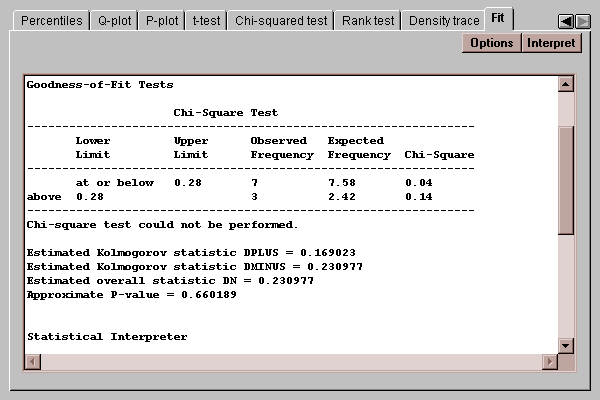
The chi-squared test compares the number of observed values in each of several intervals to the number expected given the fitted distribution. The Kolmogorov-Smirnov test compares the cumulative distribution of the data to that of the fitted distribution. In either case, a P-value below 0.05 would lead to a rejection of the fitted distribution as adequate for the data.
Select the distribution to be fit to the data:
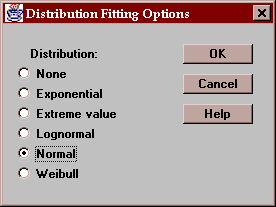
After selecting a distribution, the output on many tabs will reflect the fit.