This statlet compares two columns of data, where the data in each column represent independent samples from two populations. It constructs various statistics, performs hypothesis tests and constructs various graphs. Many of the tests performed are designed to determine whether or not there are significant differences between the populations from which the two samples come. The tabs are:
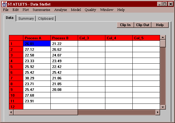
The sample data consist of the measured yields of 11 batches of a product using Process A (a new method) and the yields of 9 batches using Process B (the old method):
The question of interest is whether the new method gives better yields than the old method, i.e., a larger mean and/or a smaller standard deviation.
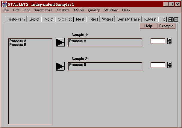
Enter the names of two numeric columns containing the data values:
This tab produces a table of numerical statistics for the each of the two columns:
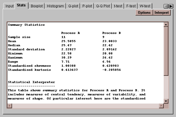
In this case, the mean yield for process A is 25.59, while the mean yield for process B is 23.00. This suggests that process A may generate higher yields on average than process B, a hypothesis that will be tested below using a t-test.
For a discussion of other summary statistics, refer to the One Variable Analysis statlet.
The Options button permits you to select any of 18 different statistics to compute:
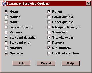
For definitions of each of these statistics, refer to the Glossary.
This tab displays box-and-whisker plots for the two samples
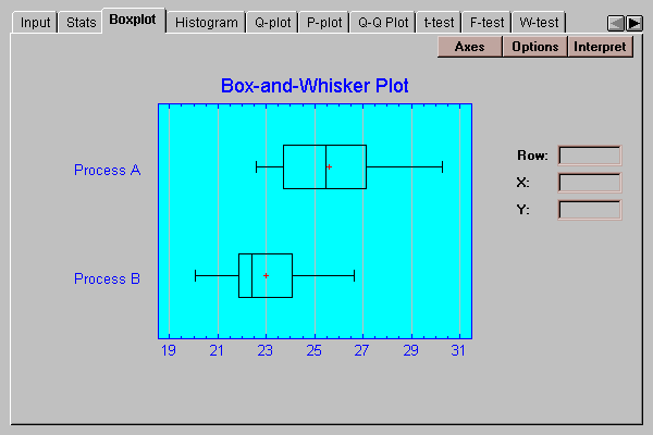
Box-and-whisker plots are useful graphs for displaying many aspects of samples of numeric data. Their construction is discussed in the One Variable Analysis statlet.
In this case, the offset of the two boxes indicates that yields from Process A tend to be higher than those from Process B. The wider spread for Process A may also indicate somewhat larger variability.
The Options button permits you to control various aspects of the plot:
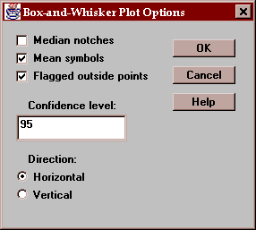
These include:
Median notches - if checked, notches are added to the boxes indicating the location of uncertainty intervals for the medians. These intervals are scaled in such a way that if they do not overlap, there is a statistically significant difference between the two population medians at the indicated confidence level.
Mean symbols - if checked, the locations of the sample means are shown as plus signs.
Flagged outside points - if checked, the whiskers extend outward to the most extreme points which are not outside points. All outside points are marked with special symbols. If not checked, the whiskers extend outward to the minimum and maximum values in the samples.
Confidence level - specifies the confidence level for the median notches.
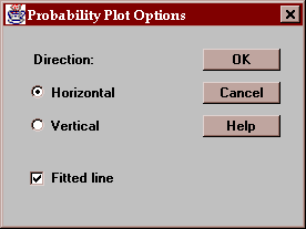
Direction - specifies the orientation of the plot.
The plot below includes median notches drawn at the 95% confidence level:
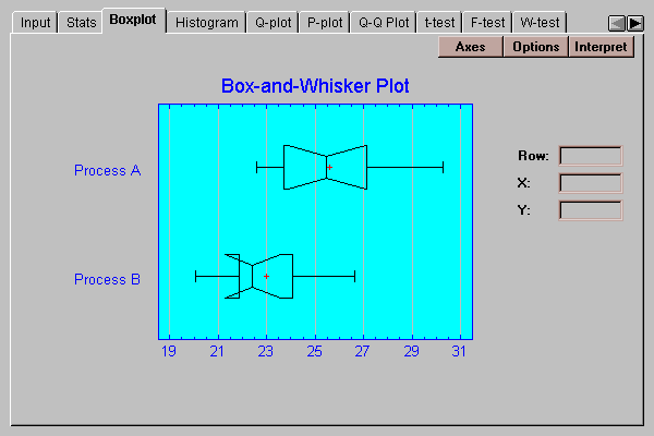
Since the notches do not overlap in the horizontal direction, there is a significant difference between the medians of the populations from which the process A yields were obtained and the process B yields were obtained. This statement may be made with 95% confidence.
Note: the apparent folding of the notch for process B occurs because the lower end of its median notch lies below the lower quartile.
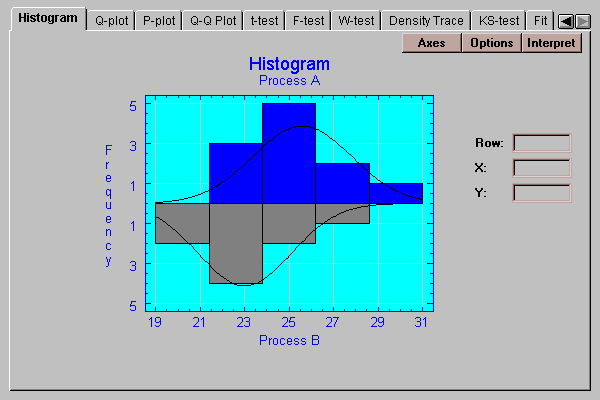
This tab creates a frequency histogram for each of the two samples, one extending above the baseline and the other below. The height of the bars is equal to the number of data values in a set of non-overlapping intervals:
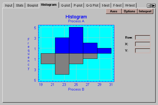
The number of intervals and the limits are set by pressing the Options button.
The Options button lets you specify how the intervals are defined:
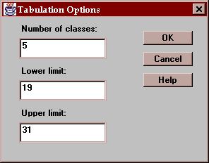
The fields are:
Number of classes - the number of intervals into which the data will be divided.
Lower limit - the lower limit of the first class.
Upper limit - the upper limit of the last class.
This tab creates a quantile plot for each sample:
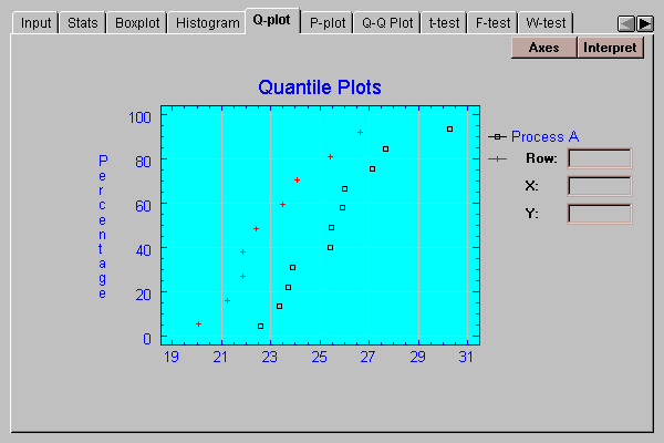
On this plot, the data values are plotted in sorted order along the horizontal axis. The vertical positions shown are (i-0.5)/(n+0.25), for i=1, 2, …, n. If the data come from a normal distribution, the points should show an S-shaped pattern.
A graphical check of the normality of the data can be made by selecting the P-plot tab:
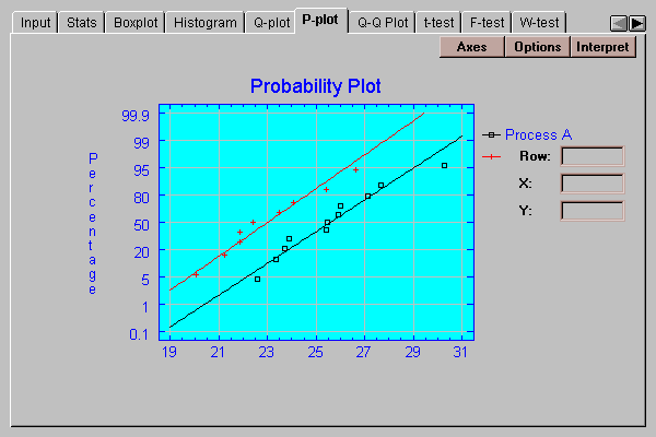
This plot is similar to the quantile plot, except that the vertical axis is scaled in such a way that if the data come from a normal distribution, the points will plot approximately along straight lines. The ordered observations are plotted at vertical locations defined by 100*(i-.375)(n+0.25). Lines have been superimposed on the plot corresponding to normal distributions with the same means and same standard deviations as the data. Both of these samples correspond well to normal distributions.
The Options button determines the orientation of the plot and whether or not lines are superimposed on the points:
This tab creates a quantile-quantile plot for the data:
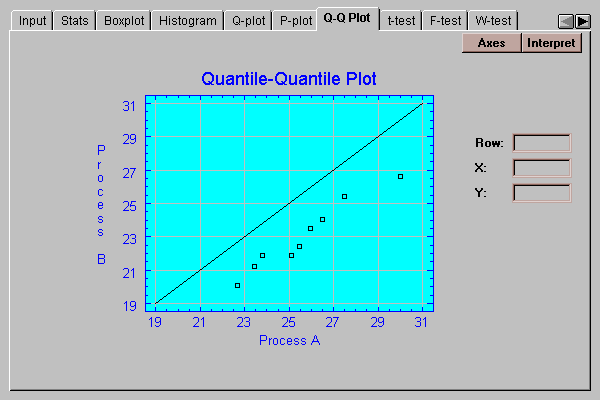
On this plot, points are drawn for each observation in the smaller sample (process A) versus estimated quantiles of the larger sample (process B). If the two samples come from the same population, the points should fall around a diagonal line with slope equal to 1.0 and intercept equal to 0. In this case, the points:
The statistical significance of these results will be tested below.
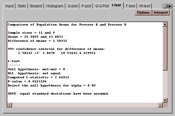
This tab computes confidence intervals and hypothesis tests for the difference between the means of the two populations from which the sample data came:
The means of the two populations are compared by first defining
delta = mu1 - mu2
to be the difference between the means. Confidence intervals and hypothesis tests may then be performed on this difference.
STATLETS distinguishes between two situations:
In the first case, which is assumed unless you specify otherwise using the Options button, an exact procedure is used. In the second case, an approximate procedure is used. You may run a test to determine whether or not it is reasonable to make the equal variance assumption by pressing the F-test tab.
The top of the output shows the two sample sizes, sample means, the estimated difference between the means and a 95% confidence interval for that difference. Of particular interest is the confidence interval for the difference, which is:
2.58 +/- 2.05
This implies that we are 95% confident that the true difference between the means lies somewhere between 0.53 and 4.63. Since this interval does not contain 0.0, the mean of process A is significantly higher than the mean of process B.
The lower half of the display shows the results of a t-test run to test specific hypotheses about delta. By default, a two-sided test is performed, which tests the hypotheses:
H0: delta = 0
HA: delta ~= 0
The computed t statistic equals 2.65, with a P-value of 0.016. Since the P-value is less than 0.05, we can reject the null hypothesis that delta = 0 at the 5% significance level. Consequently, we can declare the two means to be significantly different from each other.
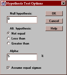
Use this button to specify the test to be performed:
Enter:
Null hypothesis - the value of delta specified by the null hypothesis.
Alt. Hypothesis - select a two-sided test (~=) or a one-sided test.
Alpha - the probability of a Type I error, which is a situation where a true null hypothesis is incorrectly rejected. Typical values for alpha are 10%, 5%, and 1%. The confidence interval is also affected by this setting and uses a confidence level equal to (100-alpha)%.
Assume equal sigmas - whether to assume that the samples come from populations with the same standard deviation.
This tab calculates confidence intervals and tests for the ratio of the variances of the populations from which the two samples come:
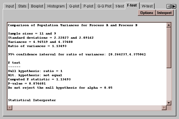
The confidence interval indicates that the ratio of the population variances lies between 0.26 and 4.38. The F test considers the following competing hypotheses:
H0: ratio = 1
HA: ratio ~= 1
It computes a test statistic according to the equation
F = s12/s22
Since the P-value associated with the test is greater than 0.05, we cannot reject the null hypothesis at the 5% significance level. Therefore, there is not a statistically significant difference between the populations sigmas at the 5% significance level.
Use this button to specify the test to be performed:
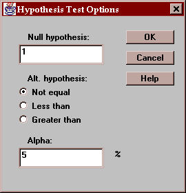
Enter:
Null hypothesis - the value of the ratio specified by the null hypothesis (usually 1.0).
Alt. Hypothesis - select a two-sided test (~=) or a one-sided test.
Alpha - the probability of a Type I error, which is a situation where a true null hypothesis is incorrectly rejected. Typical values for alpha are 10%, 5%, and 1%. The confidence interval is also affected by this setting and uses a confidence level equal to (100-alpha)%.
This tab compares the medians of the populations from which the two samples come:
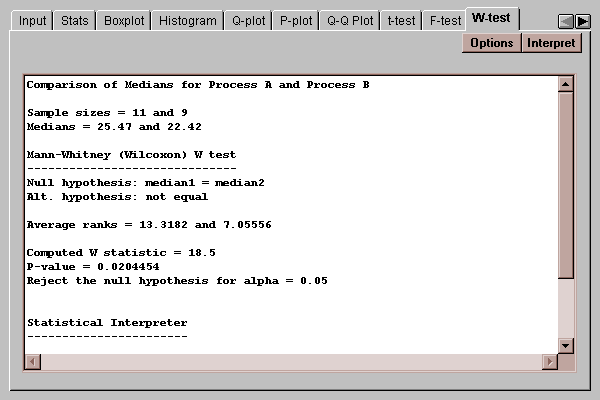
It does so by combining the two samples into a single sample, ranking the data values from smallest to largest, and computing the average rank of the values in each of the original samples.
The two-sided test selects between the two hypotheses:
H0: median1 = median2
HA: median1 ~= median2
Of particular interest is the P-value of 0.02. Since this value is less than 0.05, we can reject the null hypothesis that the medians are the same at the 5% significance level.
Use this button to specify the test to be performed:
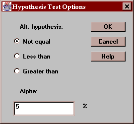
Enter:
Alt. Hypothesis - select a two-sided test (~=) or a one-sided test.
Alpha - the probability of a Type I error, which is a situation where a true null hypothesis is incorrectly rejected. Typical values for alpha are 10%, 5%, and 1%.
This tab plots a density trace for the two data samples:
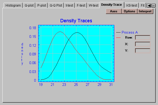
A density trace is produced by moving a window of selected width through the range of the data and counting (usually in a weighted manner) how many observations fall within the window at any selected value of X. It provides a nonparametric estimate of the density functions from which the data samples came.
Select the desired options for the density trace:
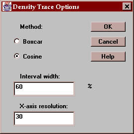
Indicate:
Method - the type of weighting function used when counting the observations within the window. The default method uses a cosine shaped weighting function, which usually gives smoother results than the rectangular boxcar method.
Interval Width - the width of the moving window as a fraction of the range of the data. The default value is usually fine when using the cosine method.
X-axis Resolution - how many locations along the X-axis at which an estimate of the density function is made. Increasing this number may give a smoother plot.
The Kolmogorov-Smirnov tests is used to determine whether the populations from which the two samples came are the same:
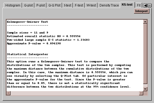
The statistic DN is equal to the maximum vertical distance between the two curves in the quantile plot shown earlier. In this case, the two curves differ by at most about 56%. The P-value shown tests the hypotheses:
H0: distribution1 = distribution2
HA: distribution1 ~= distribution2
Since the P-value is well above 0.05, we would not reject the null hypothesis. According to this test, the two distributions are not significantly different from one another.
Note: the KS test is known to have little power, particularly for small samples. Lack of a significant result here is not sufficient evidence to assert that the distributions are identical.
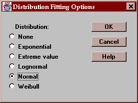
This tab allows you to fit a probability distribution to each of the data samples. After pressing the Options button and selecting a distribution, it estimates the parameters of that distribution and performs a chi-squared goodness-of-fit test if the sample sizes are large enough:
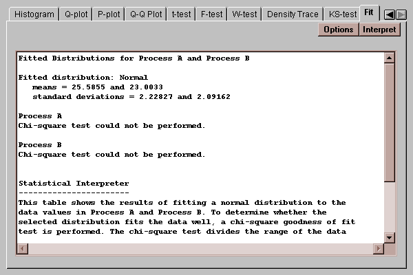
The above output shows the results of fitting a normal distribution to the data samples. Unfortunately, the samples are too small to determine whether or not the distributions fit the samples well.
Select the distribution to be fit to the data:
After selecting a distribution, the output on many tabs will reflect the fit. For example, the Histogram tab will display the fitted distributions on top of the bars: