This statlet compares samples taken from several different populations, where observations are grouped according to a blocking factor. It calculates summary statistics, performs an analysis of variance, and displays the data in various ways. The tabs are:
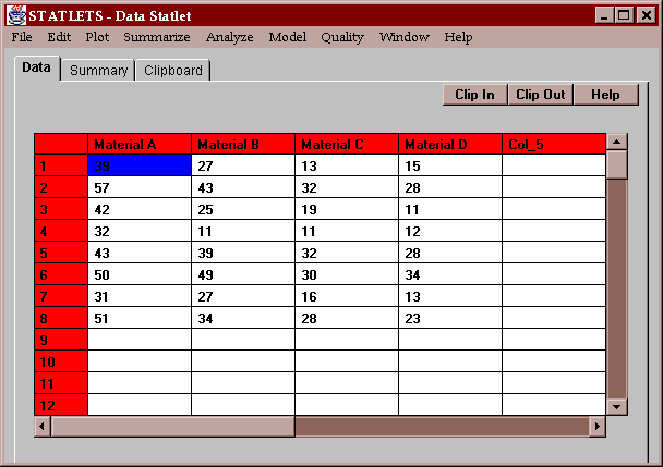
The example data consists of the measured breaking strength of 32 widgets. 8 widgets were made from each of 4 materials, and the resulting strengths are shown below:
In this example, we will consider each row to represent a separate block (perhaps defining the day on which the widgets were made).
The Oneway ANOVA with Blocking statlet performs a similar analysis to this statlet, with all measurements placed into a single column and additional columns indicating the type of material and block number.
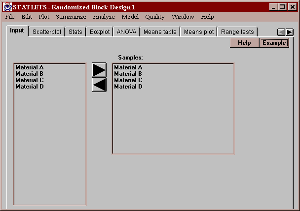
Enter the names of the columns containing each of the data samples:
Each row is assumed to constitute a separate block.
This tab shows a plot of the data values by column:
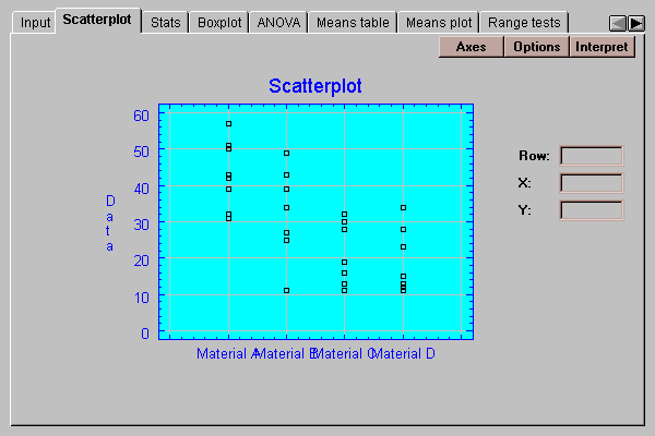
Notice that the strengths of the widgets made from materials A and B appear to be greater than that of widgets made from materials C and D.
Specify the desired orientation for the plot:
Indicate the axis along which the data values will be displayed.
This tab displays a table of summary statistics for each column:
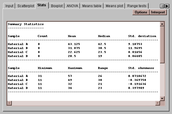
Initially, a set of commonly computed statistics is displayed. You can request other statistics by pressing the Options button.
For a discussion of other summary statistics, refer to the One Variable Analysis statlet.
The Options button permits you to select any of 18 different statistics to compute:
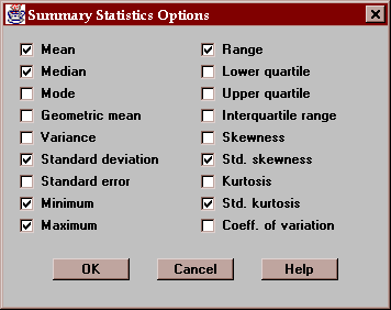
For definitions of each of these statistics, refer to the Glossary.
This tab displays box-and-whisker plots for the different samples:
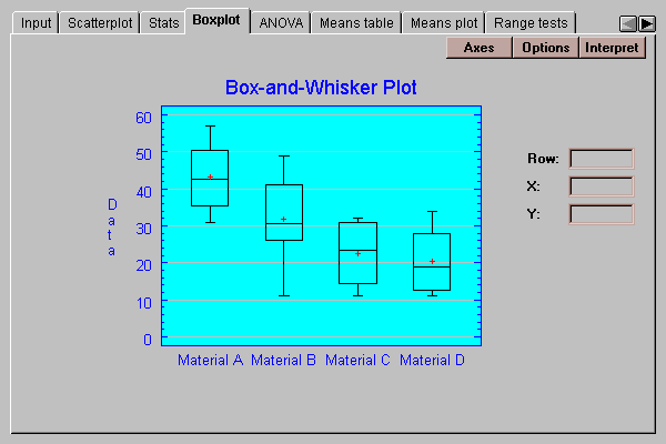
Box-and-whisker plots are useful graphs for displaying many aspects of samples of numeric data. Their construction is discussed in the One Variable Analysis statlet.
The Options button permits you to control various aspects of the plot:
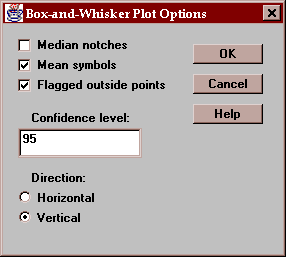
These include:
Median notches - if checked, notches are added to the boxes indicating the location of uncertainty intervals for the medians. These intervals are scaled in such a way that if two intervals do not overlap, there is a statistically significant difference between the two population medians at the indicated confidence level.
Mean symbols - if checked, the location of the sample means are shown as plus signs.
Flagged outside points - if checked, the whiskers extend outward to the most extreme points which are not outside points. All outside points are marked with special symbols. If not checked, the whiskers extend outward to the minimum and maximum values in the samples.
Confidence level - specifies the confidence level for the median notches.
Direction - specifies the orientation of the plot.
This tab displays an analysis of variance table for the data:
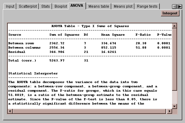
The table takes the original variability among the 32 measured breaking strengths and divides it into three components:
The P-values in the rightmost column of the table are used to determine whether significant differences exist between rows and between columns. P-values below 0.05 indicate statistically significant differences at the 5% significance level. In the above example, there are significant differences between both rows and columns.
This tab displays the mean of each group together with uncertainty intervals:
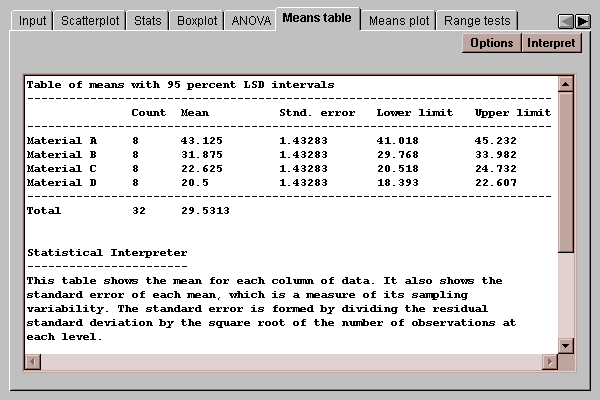
The uncertainty intervals bound the estimation error in the means using one of several methods, selected by pressing the Options button. The choice of intervals is described in detail in the Completely Randomized Design statlet.
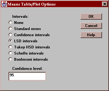
Select the desired type of uncertainty intervals:
This tab plots the group means with uncertainty intervals:
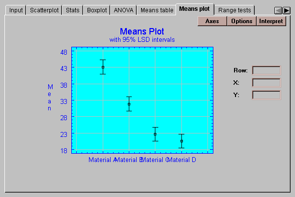
See the discussion under Means table for an explanation of the intervals.
Select the desired type of uncertainty intervals:
This tab indicates which means are significantly different from which others:
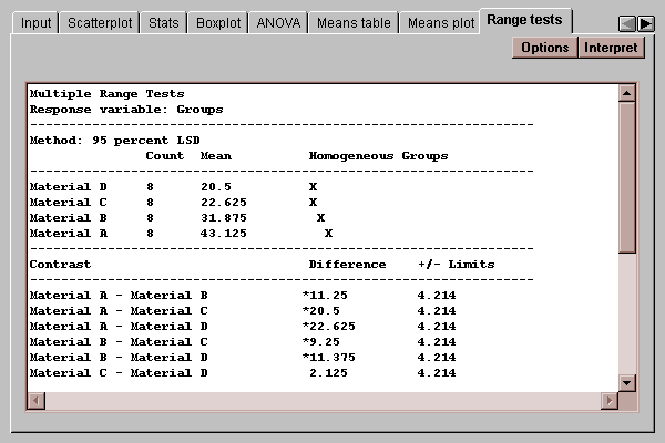
The output of this tab is described in the Completely Randomized Design statlet.
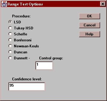
Select the desired procedure and the level of confidence:
This tab plots the residuals by group:
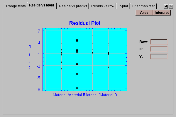
In a oneway analysis of variance, the residuals are equal to the data values minus the mean of the group from which they come. If the standard deviations within each group are the same, we should see approximately the same scatter amongst the residuals for each material. In this case, there are small differences between the spreads of the residuals in the four groups. We don’t usually start to worry, however, until the standard deviations differ by more than a factor of 3 to 1 between the largest and the smallest. The analysis of variance is known to be reasonably robust at differences of less than this magnitude, which means that the confidence levels stated are approximately correct. The differences here are much less than 3 to 1.
This tab plots the residuals versus predicted values of strength:
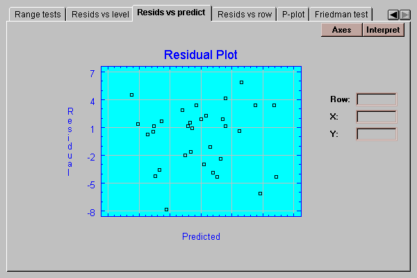
It is useful for detecting possible violations of the assumption of constant within group variability. Frequently, the variability of measurements increases with their mean. If so, the above plot would show points falling into a funnel-shaped pattern, increasing in spread from left to right. Such observed heteroscedasticity may often be eliminated by analyzing the logarithms of the data rather than the original data values.
This tab plots the residuals versus row number:
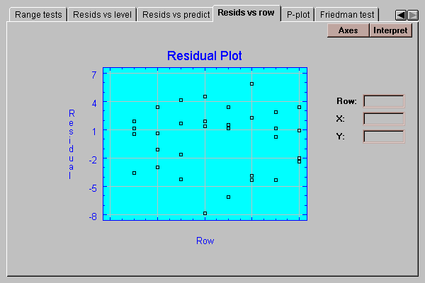
If the data were entered in time order, any pattern in the above plot would indicate changes over the course of the data collection.
This tab creates a normal probability plot for the residuals:
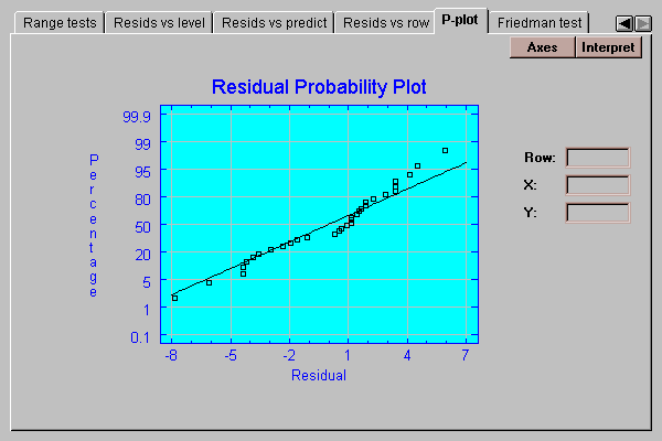
If the residuals come from a normal distribution, the points should lie approximately along a straight line as shown above.
This tab displays the results of a Friedman rank sum test:
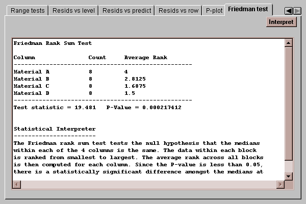
This test is a nonparametric alternative to the standard analysis of variance. It tests the hypotheses:
H0: all group medians are equal
HA: all group medians are not equal
A P-value below 0.05, as in the above table, indicates a statistically significant difference between the medians at the 5% significance level.