This statlet analyzes a single column of numeric data. It calculates statistics, performs hypothesis tests, and constructs various graphs. Optionally, one of several probability distributions may be fit to the data. The tabs are:
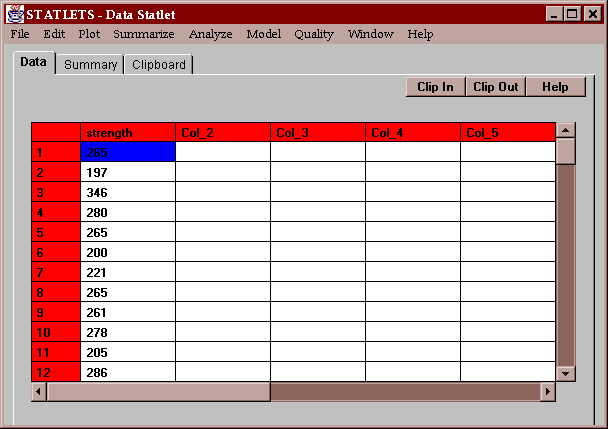
The sample data consists of the measured breaking strengths of 100 glass bottles sampled from a production line:
The bottles are supposed to be produced so as to have a mean of 250 psi and a standard deviation of no more than 25 psi. Summaries of the data are desired, as are tests to determine whether the data comes from a distribution with the desired mean and standard deviation.
The input panel requires the name of a single column of numeric data:
The column may be transformed if desired using the spinner.
This tab produces a table of numerical statistics for the data:
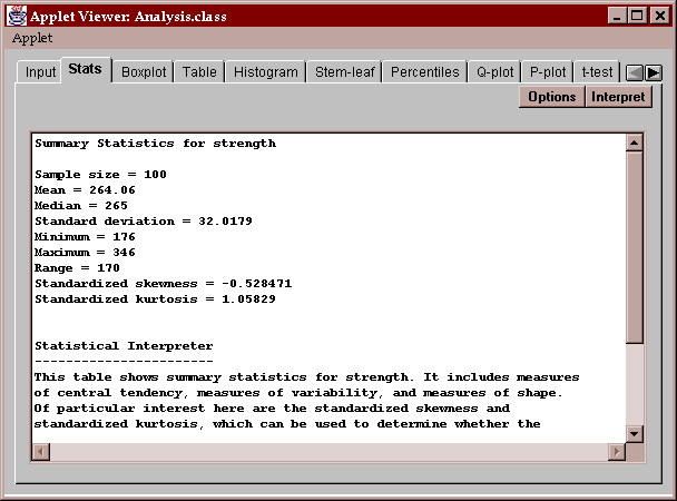
Initially, a set of commonly computed statistics is displayed. You can request other statistics by pressing the Options button as described below.
The statistics computed fall into several basic categories:
measures of central tendency - statistics which describe the center of the data, including the mean, the median, the mode, and the geometric mean.
measures of spread - statistics which describe the dispersion of the data, including the variance, standard deviation, range, and interquartile range.
measures of shape - statistics which compare the shape of the data to that of a normal distribution, including the skewness and kurtosis.
Of particular interest in this data are:
The average and median, which are very close to each other. These two statistics measure the center of the data in somewhat different ways. The average, which sums the observations and divides by the sample size, measures the center of mass of the data and is sensitive to the presence of outliers or a long tail on one side. The median, which simply orders the data from smallest to largest and finds the point which splits the data in half, is much less sensitive to outliers or a long tail. The fact that both statistics are so close indicates that the data is probably fairly symmetric with no outliers or long tails.
The standard deviation of 32.0179 is the usual sample statistic s obtained by summing the squared deviations of the observations from the sample mean, dividing by (n-1), and taking the square root. The variance is simply s2. The standard error is s/n1/2.
The range of the data R equals the maximum minus the minimum.
The interquartile range equals the difference between the upper quartile and the lower quartile. The lower quartile indicates the point below which lies 25% of the data. The upper quartile indicates the point below which lies 75% of the data.
The skewness and standardized skewness measure how symmetric the data is. Data from a normal distribution will have a skewness value around 0. Data with a long upper tail will have a positive value, while data with a long lower tail will have a negative value. The standardized skewness can be used to determine whether the observed skewness is consistent with the hypothesis that the data come from a normal distribution. If the data come from a normal distribution, the standardized skewness should fall within the range (-2, 2), as it does in this case.
The kurtosis and standardized kurtosis measure how close the distribution of the data is to the bell-shape of a normal distribution. Data from a normal distribution will have a kurtosis value around 0. Data from a distribution with a sharper peak than the normal will have a positive value, while data from a distribution with a flatter peak will have a negative value. The standardized kurtosis can be used to determine whether the observed kurtosis is consistent with the hypothesis that the data come from a normal distribution. If the data come from a normal distribution, the standardized kurtosis should fall within the range (-2, 2). Again, this data is consistent with that from a normal distribution.
The coefficient of variation is defined as 100*(standard deviation)/mean. In this case, it indicates that the standard deviation of bottle breaking strengths is about 12% of the mean.
The Options button permits you to select any of 18 different statistics to compute:
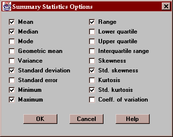
For definitions of each of these statistics, refer to the Glossary.
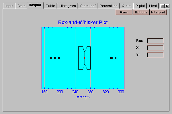
This tab displays a box-and-whisker plot for the data:

A box-and-whisker plot is a very useful graph for displaying many aspects of a sample of numeric data. Invented by John Tukey, the plot is created as follows:
A central box is drawn extending from the lower quartile to the upper quartile. This box thus covers the center half of the data.
The vertical line within the box indicates the location of the median, while the plus sign indicates the location of the mean. In this case, the two statistics are very close to one another.
The square boxes at either end indicate the location of "outside" points, which are points unusually far away from the bulk of the data. Points more than 1.5 times the interquartile range above or below the box are classified as "outside" points and shown by a square. Points more than 3.0 times the interquartile range above or below the box are classified as "far outside" and are shown as squares with plus signs. The above plot shows six outside points but no far outside points. Since we expect only approximately 1% of all points to be classified as outside when the sample comes a normal distribution, the 6 out of 100 points shown here may indicate the presence of slightly longer tails than expected from a normal distribution.
The horizontal lines extending above and below the box are the whiskers. They extend to the largest and smallest values which are not classified as outside points.
The fact that the mean is close to the median, that the median is approximately in the center of the box, and that the whiskers are about the same length are all indications that the data is very symmetric.
The Options button permits you to control various aspects of the plot:
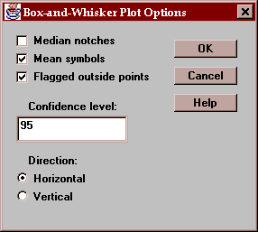
These include:
Median notches - if checked, notches are added to the box indicating the location of a confidence interval for the median.
Mean symbols - if checked, the location of the sample mean is shown as a plus sign.
Flagged outside points - if checked, the whiskers extend outward to the most extreme points which are not outside points. All outside points are marked with special symbols. If not checked, the whiskers extend outward to the minimum and maximum values in the sample.
Confidence level - specifies the confidence level for the median notch.
Direction - specifies the orientation of the plot.
The plot below includes a median notch:
The width of the notch shows a 95% confidence interval for the median of the population from which the data was obtained.
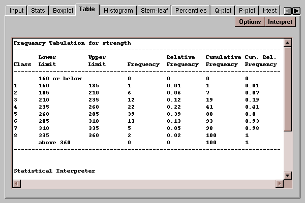
A traditional method for displaying the distribution of a set of data is to divide the range of the data into a selected number of non-overlapping intervals and to count the number of observations which fall within each of the intervals. This tab displays a table showing the results of such a tabulation:
The default number of classes is determined using Sturges' rule:
k = ceiling[1 + 3.322*log10(n)]
where n equals the size of the sample. The number and definition of the classes may be changed by pressing the Options button.
The four rightmost columns in the table show the results of the tabulation:
Frequency - the number of observations which fall within each interval. To be within the interval, a value must be greater than the lower limit and less than or equal to the upper limit.
Relative Frequency - the proportion of values within each interval.
Cumulative Frequency - the number of observations in each interval or previous intervals.
Cumulative Relative Frequency - the proportion of observations in each interval or previous intervals.
For example, 39 observations fell within the range (260,285], which represents 39% of the total. A total of 80 observations were less than or equal to 285.
The Options button lets you specify how the intervals are defined:
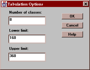
The fields are:
Number of classes - the number of intervals into which the data will be divided.
Lower limit - the lower limit of the first class.
Upper limit - the upper limit of the last class.
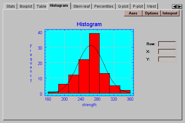
This tab creates a frequency histogram with bars of height equal to the number of data values in a set of non-overlapping intervals:

The intervals are the same as those in the frequency table described above and may be changed by pressing the Options button.
The Options button lets you specify how the intervals are defined:
The fields are:
Number of classes - the number of intervals into which the data will be divided.
Lower limit - the lower limit of the first class.
Upper limit - the upper limit of the last class.
A modification of the traditional frequency tabulation called a stem-leaf display was suggested by John Tukey. In this display, a tabulation of the data is created using the first several digits in each data value. For example, consider the first value of strength, 265. The first digit of this number, a "2", is called the stem. The second digit, a "6", is called the leaf. By collecting all leaves together which have the same stem, an interesting display results:
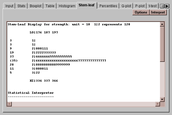
In this display, the 100 data values have been tabulated. Each row represents a range of data values. To the left of the vertical line, the stem for values in that interval is displayed. To the right of the line, a leaf is written for each value which falls in the interval. Any "outside" points, defined as in the Box-and-whisker plot described above, are written in their entirety on a low or high stem.
The result is an inverted histogram, from which you can recover the first two digits of each observation. For example, the row labeled with a stem of "2" and containing several "6"’s and "7"’s indicates that there are 21 values between 260 and 269, and 14 values between 270 and 279. The list of numbers on the far left are depth counts, which show the cumulative number of observations at each row from both ends up to the row containing the median, which is labeled as (35) to indicate that that row includes 35 values. The depth counts may be used to help locate the medians and quartiles.
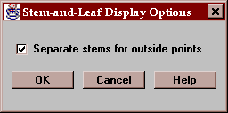
Use the Options button to indicate whether you wish outside points to be placed on separate stems or included in the main body of the display:
The lower quartile, median and upper quartile indicate values of X below which lie 25%, 50%, and 75% of the data values, respectively. These statistics are examples of percentiles. In general, the p-th percentile is a value below which lies p% of the data. (Technically, no more than p% may be less than the p-th percentile and no more than (100-p)% may be greater.)
This tab displays percentiles for the data:
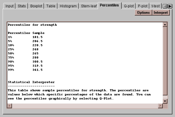
By default, percentiles are computed at 9 typical percentages, although this may be changed by pressing the Options button. As an example, the table indicates that 90% of the data values for strength fall below 300.5.
Use the Options below to indicate the percentages at which you wish percentiles to be computed:
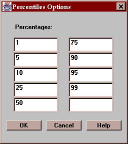
All numbers entered must be greater than 0 and less than 100.
This tab creates a quantile plot for the data:
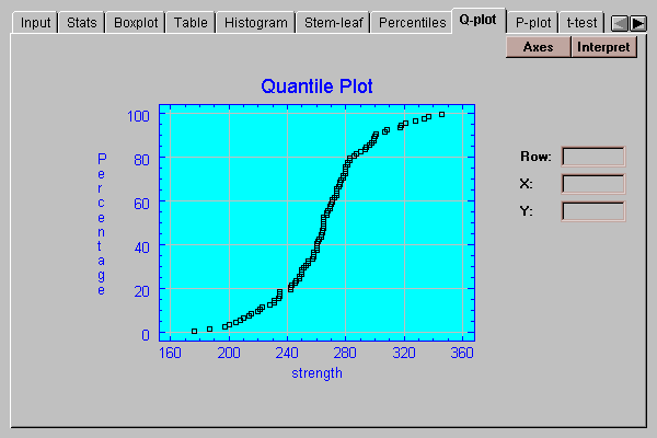
On this plot, the data values are plotted in sorted order along the horizontal axis. The vertical positions shown are (i-0.5)/(n+0.25), for i=1, 2, …, n. If the data come from a normal distribution, the points should show an S-shaped pattern, as in the above plot.
A graphical check of the normality of the data can be made by selecting the P-plot tab:
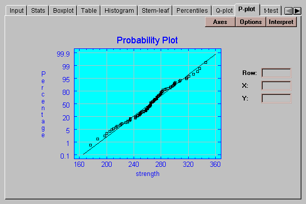
This plot is similar to the quantile plot, except that the vertical axis is scaled in such a way that if the data come from a normal distribution, the points will plot approximately along a straight line. The ordered observations are plotted at vertical locations defined by 100*(i-.375)/(n+0.25). A line has been superimposed on the plot corresponding to a normal distribution with the same mean and same standard deviation as the data.
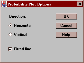
The Options button determines the orientation of the plot and whether or not a line is superimposed on the points:
This tab computes confidence intervals and hypothesis tests for the mean of the population from which the sample data come:
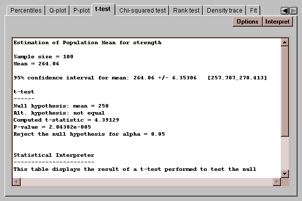
The confidence interval indicates how precisely the sample mean estimates the mean of the population. In repeated sampling, 95% confidence intervals will cover the true population mean 95% of the time. You may change the level of confidence by pressing the Options button.
The t-test performs a classic hypothesis test concerning the population mean. To perform the test, you first select the hypotheses to be tested. For example, suppose the desired mean bottle strength was 250 psi. The null and alternative hypotheses would then be formulated as:
H0: mu = 250
HA: mu ~= 250
This is a case of a two-sided test, where the alternative hypothesis allows for situations where the mean may be smaller or larger than that hypothesized by the null hypothesis.
The computed t statistic is
t = (xbar - mu0) / s
where xbar is the sample mean, s is the sample standard deviation, and mu0 is the value of the population mean specified by the null hypothesis. The P-value indicates how likely it is that we would obtain a t-statistic as large as that observed if the null hypothesis is true. If the P-value is less than the desired alpha risk, we reject the null hypothesis.
In the above example, the P-value for the t-test concerning the population mean is 0.000028, which is well below 0.05 and therefore leads to a rejection of the hypothesis that the data come from a population with a mean of 250 psi at the 5% significance level. Note also that the entire confidence interval for the mean lies entirely above 250, indicating that the population from which the data comes has a mean somewhere between 257.7 and 270.4.
Note: unless the sample size is very small, the confidence interval and t-test shown above will be accurate whether or not the data come from a normal distribution.
Use this button to specify the test to be performed:

Enter:
Null hypothesis - the value of the mean specified by the null hypothesis.
Alt. Hypothesis - you may select a one-sided test if desired, which would change the alternative hypothesis in the above example to mu < 250 or mu > 250
Alpha - the probability of a Type I error, which is a situation where a true null hypothesis is incorrectly rejected. A value of 5% for alpha indicates that the test will incorrectly reject the null hypothesis when it is true 5% of the time. Typical values for alpha are 10%, 5%, and 1%. The confidence interval is also affected by this setting and uses a confidence level equal to (100-alpha)%.
This tab calculates confidence intervals and tests for the standard deviation:
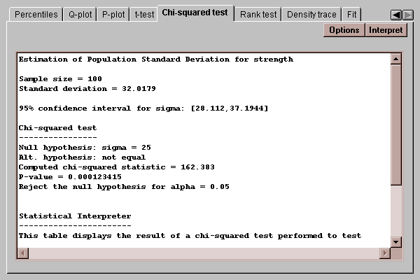
The confidence interval indicates that the population standard deviation lies between 28.1 and 37.2. The chi-squared test considers the following competing hypotheses:
H0: sigma = 25
HA: sigma ~= 25
It computes a test statistic according to the equation
chi-squared = (n-1)s2/sigma02
where sigma0 is the value of the standard deviation specified by the null hypothesis. Since the P-value associated with the test is less than 0.05, we can reject the null hypothesis at the 5% significance level.
Use this button to specify the test to be performed:
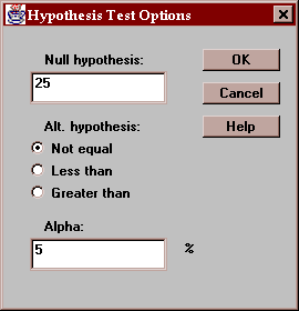
Enter:
Null hypothesis - the value of sigma specified by the null hypothesis.
Alt. Hypothesis - select a two-sided test (~=) or a one-sided test.
Alpha - the probability of a Type I error, which is a situation where a true null hypothesis is incorrectly rejected. Typical values for alpha are 10%, 5%, and 1%. The confidence interval is also affected by this setting and uses a confidence level equal to (100-alpha)%.
This tab conducts a test concerning the median of the population from which the data came:
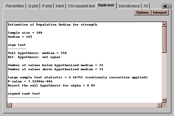
Two tests are performed:
A sign test, which counts the number of observations on either side of a hypothesized value for the median.
A signed rank test, which computes the distance of each point from the hypothesized median, ranks the absolute distances, and compares the average rank of observations below the hypothesized median to those above.
Of particular interest are the P-values for the tests. P-values below 0.05 lead to rejection of the hypothesized median at the 5% significance level.
Use this button to specify the test to be performed:
Enter:
Alt. Hypothesis - select a two-sided test (~=) or a one-sided test.
Alpha - the probability of a Type I error, which is a situation where a true null hypothesis is incorrectly rejected. Typical values for alpha are 10%, 5%, and 1%.
This tab plots a density trace for the data sample:
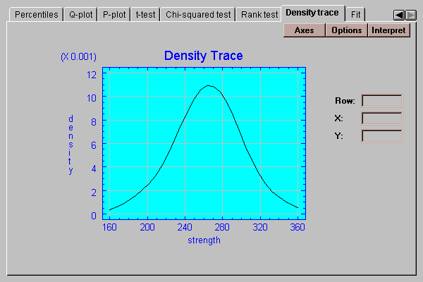
A density trace is produced by moving a window of selected width through the range of the data and counting (usually in a weighted manner) how many observations fall within the window at any selected value of X. It provides a nonparametric estimate of the density function from which the data sample came. The above trace, which was generated without making any assumptions about the underlying type of distribution, looks remarkably symmetric and bell-shaped.
Select the desired options for the density trace:
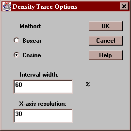
Indicate:
Method - the type of weighting function used when counting the observations within the window. The default method uses a cosine shaped weighting function, which usually gives smoother results than the rectangular boxcar method.
Interval Width - the width of the moving window as a fraction of the range of the data. The default value is usually fine when using the cosine method.
X-axis Resolution - the number of locations along the X-axis at which an estimate of the density function is made. Increasing this number may give a smoother plot.
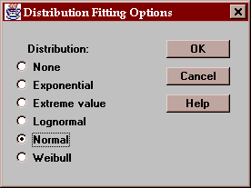
This tab allows you to fit a probability distribution to the data sample. After pressing the Options button and selecting a distribution, it estimates the parameters of that distribution and performs two goodness-of-fit tests if the sample size is large enough:
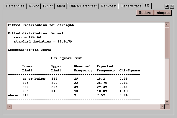
The chi-squared test, shown above, compares the number of observed values in each of several intervals to the number expected given the fitted distribution. The Kolmogorov-Smirnov test, shown below, compares the cumulative distribution of the data to that of the fitted distribution. In either case, a P-value below 0.05 would lead to a rejection of the fitted distribution as adequate for the data.
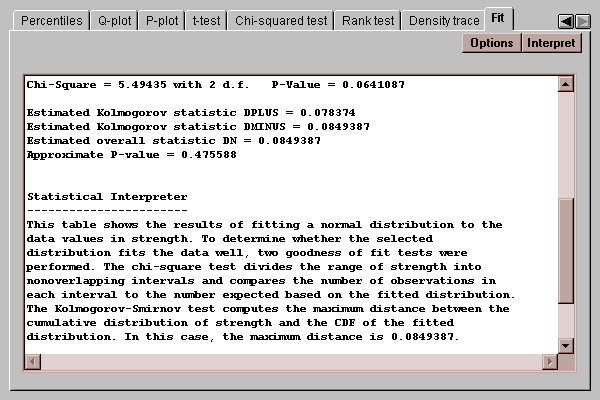
In this case, both P-values are greater than 0.05, so we cannot reject the hypothesis that the data come from a normal distribution at the 5% significance level.
Select the distribution to be fit to the data:
After selecting a distribution, the output on many tabs will reflect the fit. For example, the Histogram tab will display the fitted distribution on top of the bars: