
This statlet computes numerical statistics and summary plots for one or more columns of numeric data. It is meant to provide a quick display of multiple columns. A more extensive selection of tables and plots for a single column of data can be found under Analyze - One Variable.
The tabs are:
The example data consists of 25 cases and 5 variables:
Each row shows information about the commuting time of a student at a local community college. It includes the travel time, the distance of the commute, how many traffic lights each student passes, whether or not he or she rides in a carpool, and the starting time of each student's first class in minutes after 8:00 AM.
Specify one or more columns of numeric data:

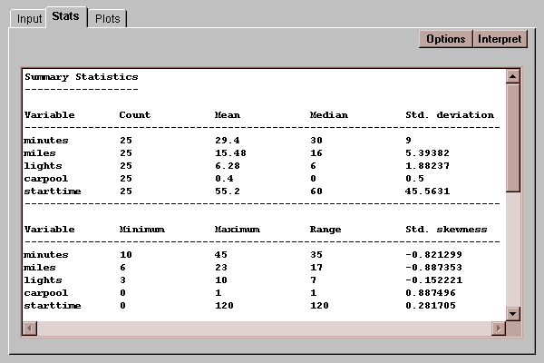
This tab computes various summary statistics for each column:
The summary statistics are selected by pressing the Options button.

The list contains three basic types of statistics:
- measures of central tendency - statistics which describe the center of the data, including the average (mean), the median, the mode, and the geometric mean.
- measures of spread - statistics which describe the dispersion of the data, including the variance, standard deviation, range, and interquartile range.
- measures of shape - statistics which compare the shape of the data to that of a normal distribution, including the skewness and kurtosis.
These statistics are also computed by the Analyze - One Variable statlet, where they are described in more detail.
This tab creates a graphical display of the data columns:

The four plots shown are:
Row 1: box-and-whisker plots - five number summaries of each column, with a box covering the center half of the data and whiskers extending to the min and max. The center line shows the median, while the plus sign shows the mean.
Row 2: jittered scatterplots - the points are offset randomly in the vertical direction to show the individual data values.
Row 3: frequency histogram - bars of height proportional to the number of data values in selected classes.
Row 4: normal probability plot - samples from a normal distribution should fall along a straight line.
Each of these plots may also be created in the Analyze - One Variable statlet, where they are explained in detail.
Select which plots should be displayed:
