Jordan Wente and Minzhe Li
nonmetric MDS:
Goal: to see
which counties are most similar. I chose these key economic and
demographic data as to identify key groupings based on statistical
similarity. I utilized 6 variables: Median Income, 65 and over, percent
population under 18, percent population over 65, % not proficient in English,
percent population living in rural areas, and percent of elementary students
eating free lunch.

There
are clearly 3 major curvilinear groupings.
The first wave, to the far right, represents the urban and suburban
counties. Carver, Scott, and
Washington are one group, for example.
In that this wave –that extends to Ramsey in the far right. The center section represents the
“standard” Lutheran, industrial yet agrarian economies of southern and west
central Minnesota.
Stress
value = .0006929; my stress value indicated an excellent fit.
To
standardize my median income values, I take the natural logarithm of median
income and include this in my MDS analysis.
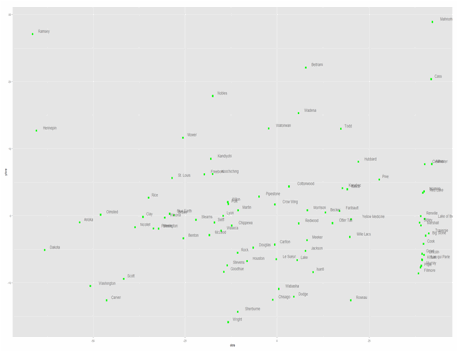
Ln(med_inc)
By
taking the natural logarithm of median income, the counties are interestingly
more evening dispersed on the 2D plane.
Though, this is intuitive, as outliers like Wright or Carver counties
are suppressed given the mathematical properties of the natural log function.
Cluster Analysis:
For
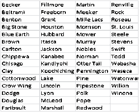
our cluster analysis, we have selected the middle cluster of counties. Concerning health issues, we want to
compare counties that are similar economically and demographically
speaking. Simply, counties like
Stevens do not face the same health concerns as counties like Olmsted or
Hennepin.
The
counties are:
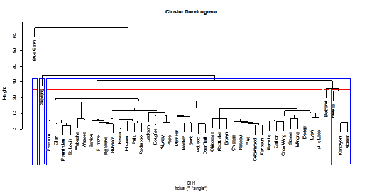
Normal Dendogram
based on “single” method
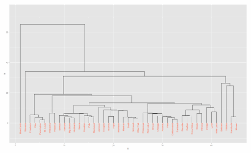
ggdendroplot
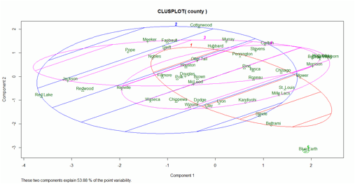
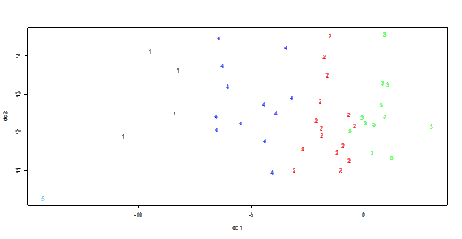
Results from clusplot
based K-means Analysis

![Description: C:\Users\vip\AppData\Roaming\Tencent\Users\380528837\QQ\WinTemp\RichOle\N_$G44S9{0C]0U7J0VM`S12.jpg](JordanMinzhe_files/image018.gif)

Model-Based Analysis of the first 15
counties in alphabetical orders