This statlet constructs control charts for observations which are taken one at a time. The tabs are:
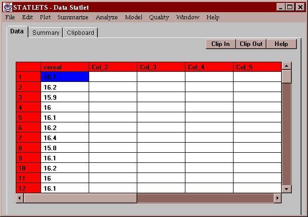
The example data consists of the measured fill weights of 100 boxes of cereal, sampled once every 15 minutes from a production line:
Although each box was labeled 16 ounces, the actual fill weights varied from box to box.
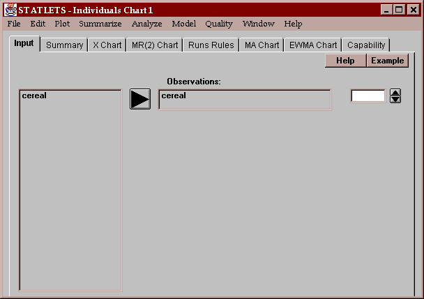
A single column of numeric data is required, containing the individual measurements in time order:
If the measurements come from a process which is in a state of statistical control, then they ought to behave like random samples from a distribution which doesn't vary over time. This tab summarizes two charts commonly created to determine whether or not the measurements come from an in-control process: an X chart and a moving range chart:
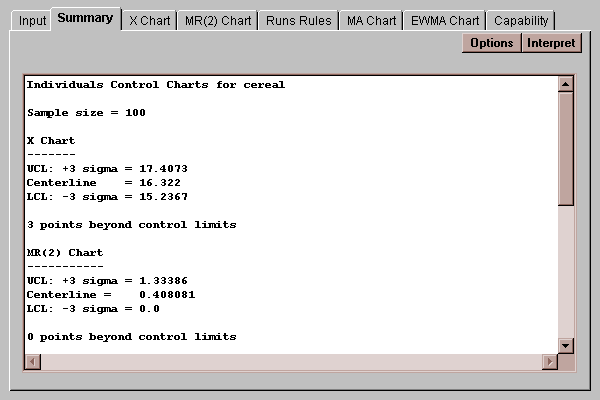
The top half of the table shows the location of the upper and lower control limits on these charts, together with a summary of how many points fall outside the control limits. The bottom half of the table shows the estimated process mean and standard deviation, together with the mean range:
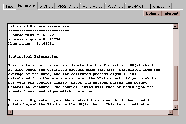
The process parameters are estimated by
process mean = x-bar
process sigma = R-bar / 1.128
where x-bar is the average of the measurements and R-bar is the average of the moving range of 2.
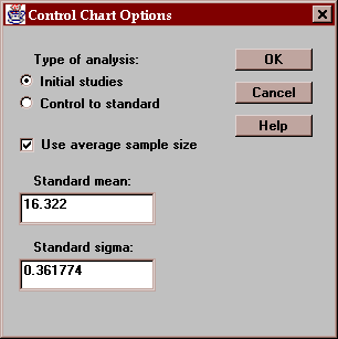
The Options button generates a dialog box allowing you to specify how the control limits should be computed:
Settings include:
Type of analysis - either "Initial studies", in which the data determine where the control limits are placed, or "Control to standard", which uses the specified standard mean and standard sigma to set the limits.
Use average sample size - for data from subgroups of different sizes, whether the control limits should be based on the average sample size or the individual subgroup sizes. This is not relevant for individuals charts where data are sampled one at a time but is relevant for other types of control charts.
The Initial studies mode is commonly used to determine whether or not a process is in a state of statistical control and to determine control limits for monitoring the process in the future. The Control to standard mode is most often used in real-time to monitor a process against pre-established limits.
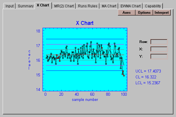
This chart plots the individual measurements with 3-sigma control limits:

Each point on the chart represents a single observation. The lines are located at:
upper control limit: mean + 3*sigma
center line: x-bar
lower control limit: mean - 3*sigma
where the mean and sigma are estimated are described above if in "Initial studies" mode, or specified by the user if in "Control to standard" mode.
Any points outside the 3-sigma control limits, such as the last 3 points in the above chart, are highlighted in red. In addition, any points which violate the Runs rules described below are also highlighted. In this case, 5 additional points have been highlighted.
You can specify various aspects of the control chart by pressing the Options button:
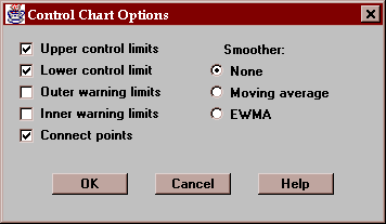
These include:
Upper control limit - if checked, an upper control limit is included on the chart.
Lower control limit - if checked, a lower control limit is included on the chart.
Outer warning limits - if checked, warning limits are drawn at the mean +/- 2 sigma.
Inner warning limits - if checked, warning limits are drawn at the mean +/- 1 sigma.
Connect points - if checked, lines are drawn connecting each of the points on the chart.
Smoother - you may superimpose a moving average or exponentially weighted moving average (EWMA) on the chart. These smoothers are used to help estimate any trend which might be present in the data. They may also be drawn separately using the MA and EWMA tabs. When drawn here, they use the settings you specified via the Options button on those tabs.
The following chart shows both outer and inner warning limits together with an EWMA smoother:
This tab shows the moving range chart:
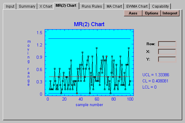
Each point plotted corresponds to the range of a group of 2 consecutive points, starting with points 1 and 2, then points 2 and 3, etc. In "Initial studies" mode, the lines are placed at:
upper control limit: R-bar + 3*d3*sigma
center line: R-bar
lower control limit: R-bar - 3*d3*sigma
where d3 is a constant taken from standard tables which may be found in any text on statistical process control. In "Control to standard" mode, they are placed at locations based on the specified process sigma. Any points outside the control limits are highlighted, as are any which violate the runs rules.
The options for the MR(2) chart are the same as for the X chart.
Even though no points on a control chart may be beyond the 3-sigma control limits, other unusual patterns may suggest that the process is not in a state of statistical control. For example, a large number of consecutive points all on the same side of the centerline would suggest that the process had moved away from that center. This tab indicates whether any of seven rules for detecting unusual sequences of points have been triggered:
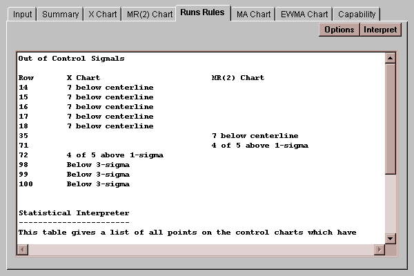
On the X chart, the rule for 7 in a row above or below the centerline was violated at points 14, 15, 16, 17, and 18. At point 72, there was a group of 5 points in which 4 or more were above 1-sigma. Two other violations were found on the MR(2) chart.
Options button:
You may select any combination of six rules to apply, together with a specification of how many points constitutes an unusual run:
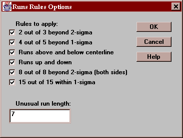
The rules are:
A: 2 out of 3 consecutive points beyond 2-sigma, on the same side of the centerline.
B: 4 out of 5 consecutive points beyond 1-sigma, on the same side of the centerline.
C: Runs of k or more consecutive points, all on the same side of the centerline, where k=7 by default.
D: Runs of k or more consecutive points, all going up or all going down, where k=7 by default.
E: 8 consecutive points beyond 2-sigma, on either side of the centerline.
F: 15 consecutive points, all within 1-sigma, on either side of the centerline.
This tab creates a "Moving Average" chart:
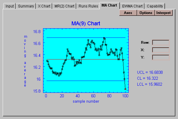
On this chart, each point plotted is the average of the last k data values, where k is called the "order" of the moving average. The control limits on this chart are located at:
upper control limit: x-bar + 3*sigma/k1/2
center line: x-bar
lower control limit: x-bar - 3*sigma/k1/2
By default, k=9 which places the control limits for this chart at x-bar +/- sigma. This has the interesting property of making the control limits for the MA chart equal to the inner warning limits for the X chart.
Note: in computing the first several points, where less than k data values are available, all data values before time period 1 are assumed to be equal to the centerline.
Use this button to change the order of the moving average:
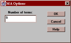
A large value of k results in a smoother but less responsive chart.
This tab creates an "Exponentially Weighted Moving Average" chart:
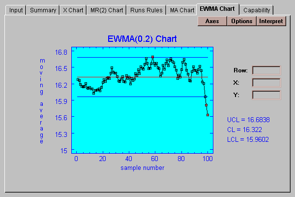
On this chart, each point plotted is a weighted average of all data values up until that point, where the more recent data is given more weight than the older data. The weights fall off exponentially into the past according to a smoothing constant lambda, which lies between 0 and 1. The control limits on this chart are located at:
upper control limit: x-bar + 3*sigma/[lambda/(2-lambda)]1/2
center line: x-bar
lower control limit: x-bar - 3*sigma/[lambda/(2-lambda)]1/2
By default, lambda=0.2 which places the control limits for this chart at x-bar +/- sigma. This has the interesting property of making the control limits for the MA chart equal to the inner warning limits for the X chart.
Note: in computing the first several points, all data values before time period 1 are assumed to be equal to the centerline.
Use this button to specify the value of lambda (0-1, exclusive):
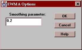
The smaller the value of the smoothing parameter, the more weight is given to the far past. This results in a smoother but less responsive chart.
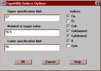
This tab displays capability indices based on the estimated process sigma:
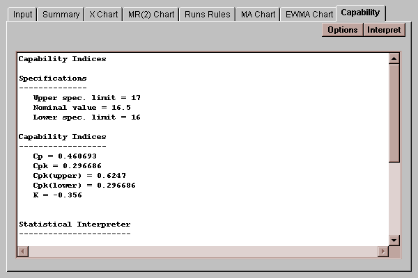
Capability indices compare the observed data to a set of specification limits, which you enter by pressing the Options button. In this example, the data is compared against a specification of 16.5 +/ 0.5 ounces.
The capability indices which may be computed are defined as follows:
Cp = (USL - LSL) / ( 6*sigma)
Cpk = min[(xbar - LSL) / (3*sigma) , (USL - xbar) / (3*sigma) ]
Cr = 1 / Cp
Cpm = (USL - LSL) / (6*sigma')
where sigma' = a modified sample standard deviation calculated by replacing the sample average with the nominal value
K = (xbar - nominal) / [(USL - LSL) / 2]
The index Cp compares the distance between the specification limits to the 6-sigma range and is only defined for two-sided specifications. Cpk compares the distance between the mean and the nearer spec limit to 3-sigma. In either case, the index must be greater than 1.0 for the process to be capable of keeping virtually all of the product within specification, although most companies prefer values of Cp and Cpk to be greater than 1.33.
Cr, the capability ratio, is the reciprocal of Cp. Cpm is similar to Cp, except it uses a modified definition of the standard deviation which measures the variability of the data around the nominal value rather than the sample mean. This modification takes into account whether or not the distribution is properly centered. If it is not, Cpm will be considerably less than Cp.
K measures how far the mean of the distribution is away from the nominal value and should be close to 0.
Note: the capability indices computed here differ from those computed by the Capability Analysis statlet in how sigma is estimated. In this statlet, sigma is estimated from the average of the moving range. In the Capability Analysis statlet, sigma is estimated from the sample standard deviation of the data values. If the process is in a state of statistical control, there won't be much difference between the two sets of indices. However, if the process is not in a state of statistical control, the indices computed here will look better than those computed in the other statlet. Some practitioners distinguish between these two sets of indices by calling those computed here Cp and Cpk (process capability indices) and those computed by the Capability Analysis statlet Pp and Ppk (process performance indices).
Use this button to enter the specification limits and to select the indices to be computed: