This statlet computes summary statistics and plots for a time series. The values of the time series are assumed to be equally spaced in time or space. Smoothers may also be applied to the time series to estimate the underlying trend and cycles.
The tabs are:
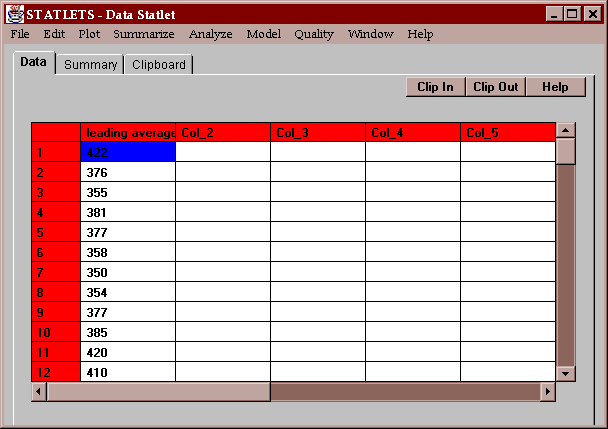
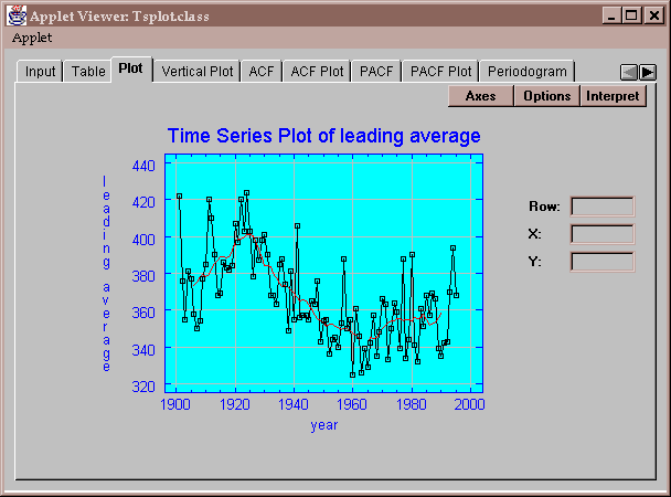
The example data consists of the leading batting average in U.S. major league baseball for every year from 1901 to 1995:
Batting averages quantify the percentage of times that a player gets a hit, shown here on a scale of 0 to 1000. The last time anyone batted over 400 was in 1941, when Ted Williams batted 406. Every year, speculation arises about whether the latest super-star has a chance of reaching the 400 level again.
To use this statlet, you must specify the name of a single column of numeric data:
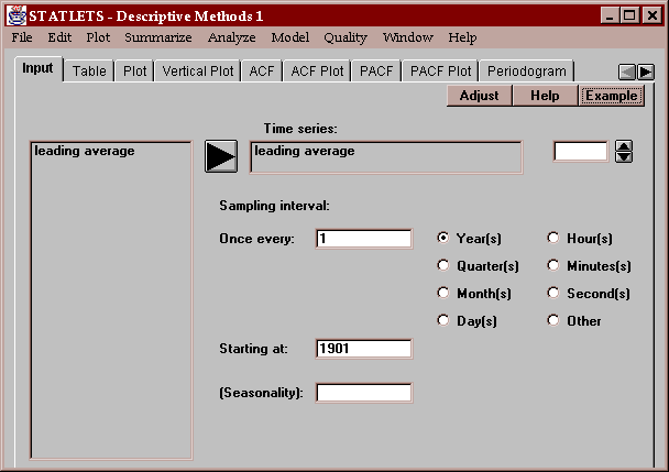
You must also enter additional information about the data, including:
Sampling interval - the interval between consecutive observations, such as once every year.
Starting at - the time period corresponding to the data value in the first row. Valid formats are:
year: a number such as 1901
quarter: a quarter such as Q1/95 indicating the first quarter of 1995.
month: an entry such as 06/85 representing June of 1985. The general format is mm/yy for month and year, where the two-digit years range from 1950 through 2049.
month: an entry such as 05/02/95 representing May 2, 1995. The general format is mm/dd/yy for month, day and year, where the two-digit years range from 1950 through 2049.
hour: a number such as 3 representing hour number 3.
minute: an entry such as 3:21 representing 3:21 a.m. Time is entered on a 24-hour scale.
second: an entry such as 13:25:30 representing 1:25:30 p.m. Time is entered on a 24-hour scale.
other: a number such as 1.
(Seasonality) - optional entry indicating the periodicity of the data, such as 12 for monthly data that cycles once a year.
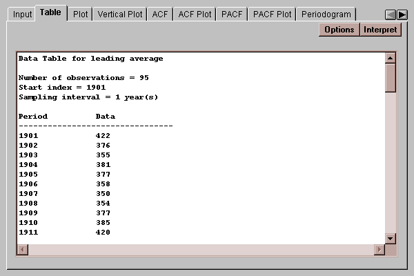
This tab displays a table for the data values:
If any missing values are found in the time series, they will be replaced by fill-in values according to the following algorithm:
At time t, find:
Yt-2s,Yt-s,Yt+s, Yt+2s where s = the length of seasonality if specified or 1 otherwise.
If none of the 4 values are missing,
Yt = -(3/18)*Yt-2s+(12/18)*Yt-s+(12/18)*Yt+s-(3/18)*Yt+2s
If only Yt+2s is missing:
Yt = -(1/3)*Yt-2s+Yt-s+(1/3)*Yt+s
If only Yt+s is missing:
Yt = -(1/2)*Yt-2s+(4/3)*Yt-s+(1/6)*Yt+2s
If only Yt-s is missing:
Yt = (1/6)*Yt-2s+(4/3)*Yt+s-(1/2)*Yt+2s
If only Yt-2s is missing:
Yt = (1/3)*Yt-s+Yt+s-(1/3)*Yt+2s
If only Yt+s and Yt+2s are missing:
Yt = -Yt-2s+2Yt-s
If only Yt-s and Yt+2s are missing:
Yt = (1/3)*Yt-2s+(2/3)Yt+s
If only Yt-s and Yt+s are missing:
Yt = (1/2)*Yt-2s+(1/2)Yt+2s
If only Yt-2s and Yt+2s are missing:
Yt = (1/2)*Yt-s+(1/2)Yt+s
If only Yt-2s and Yt+s are missing:
Yt = (2/3)*Yt-s+(1/3)Yt+2s
If only Yt-2s and Yt-s are missing:
Yt = 2*Yt+s-Yt+2s
Else the replacement cannot be done.
You may also elect to smooth the time series by pressing the Options button and selecting either one or two smoothers. If so, the smoothed values are also shown on the table. Smoothing a time series is described in the section on time series Plots.
Select the smoother or smoothers to apply to the time series:
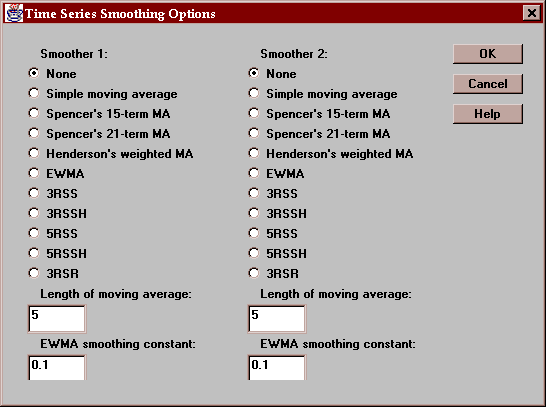
These smoothers are described below.
This tab plots the time series:
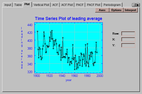
It shows the observed data values, together with a smoother selected by pressing the Options button if desired:
When the time series data contains a large amount of short-term variability, it can be difficult to see the underlying trend in a raw time series plot. Consequently, smoothers have been developed which help the analyst separate the long-term and short-term variability and thus make any trend more apparent. A popular smoothing technique to is compute a moving average, defined by
St = (Yt-k + Yt-k+1 + ... + Yt + ... + Yt+k-1 + Yt+k ) / (2k+1)
which averages the 2k+1 data values centered at time period t. When plotted as a function of t, the moving averages show how the mean of the time series varies over time. The quantity (2k+1) is called the length of the moving average. By increasing the length, you increase the amount of smoothing.
When using a moving average to smooth a time series, you have a choice of the number of terms to include in the moving average. You want to choose a high enough value that the resulting trend line is reasonably smooth, but not so high a value as to lose definition of the underlying trend. In the graph above, which uses a moving average of length 10, you will notice that the leading batting averages climbed steadily from 1901 through approximately 1925, when the time series turned around and began to drop. The decline continued until the early 1960’s, when it again began to rise. Although 5 values have been lost at each end of the series where St cannot be computed, it seems apparent that the trend continued through 1995.
Note: a moving average of even length 2k is actually computed from a weighted moving average of 2k+1 terms according to the formula
St = (0.5*Yt-k + Yt-k+1 + ... + Yt + ... + Yt+k-1 + 0.5*Yt+k ) / (2k+1)
Use the Options button to select one or more smoothers to apply to the time series:

If two smoothers are selected, they are applied in sequence, i.e., the second smoother smoothes the result of the first smoother.
The following smoothers are available:
Simple moving average - an equally weighted average of length specified on the dialog box.
Spencer's and Henderson's weighted moving averages - weighted averages developed for use in smoothing actuarial data.
EWMA - exponentially weighted moving average which averages all of the data values through time t, using the recursive equation
St = aYt + (1-a)St-1
where S0=Y1 and a is a smoothing constant between 0 and 1. The smaller a is, the more smoothing which results.
3RSS and other resistant smoothers - smoothers developed by John Tukey based on running medians rather than running averages. For example, the 3RSS smoother operates as follows:
- The time series is smoothed using running medians of 3, i.e., at each point in time the smoothed value is the median of Yt-1, Yt, and Yt+1. Since the median is the middle value of the three, the impact of any single isolated data point on the smoother is much less than if we took an average of the three.
- The resulting smooth is smoothed again using running medians. The whole process is repeated again and again until nothing changes.
- Any resulting plateaus (flat, 2-point sequences which tend to appear when using running medians) are then split.
- Steps 1 through 3 are repeated a second time.
A popular approach is to apply a resistant smooth such as the 3RSS followed by a simple, moving average. The first smoother eliminates outliers, while the second smoother gives a good picture of the underlying trend.
This tab plots the data values by drawing a vertical line from each point to a baseline:
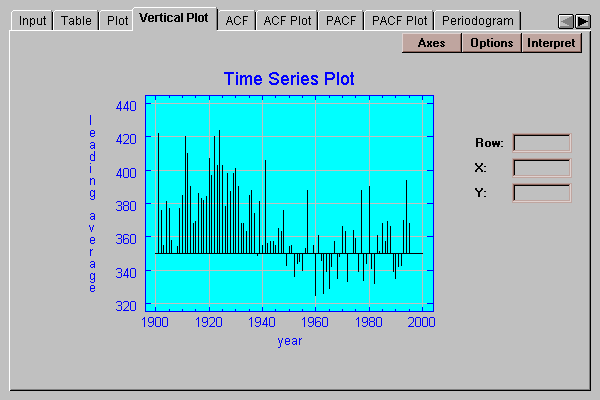
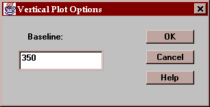
To specify a baseline other than 0, press the Options button.
Specify the numeric value from which the vertical lines are drawn:
This tab creates a table displaying the sample autocorrelation coefficients:
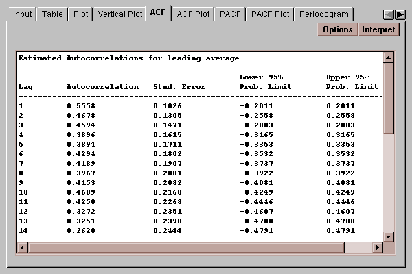
Autocorrelations are an important tool used to describe the dynamic behavior of a time series. The autocorrelation at lag k
rk = corr(Yt, Yt-k)
varies between -1 and +1 and measures the correlation between data k time periods apart. Usually, as the lag increases and the data values become farther apart in time, the autocorrelation decreases.
The table shows the autocorrelations for lags 1 through the value specified using the Options button. It also displays the large lag standard error for each coefficient, which estimates the standard error for rk assuming that all correlations at lag k and higher lags equal 0. This standard error is used to derive the probability limits in the two rightmost columns of the table. Any autocorrelation outside the 95% probability limits is significantly different from zero at the 5% significance level.
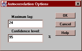
Specify the maximum lag to be included on the table and the confidence level for the probability intervals:
This tab plots the sample autocorrelation coefficients with probability limits:
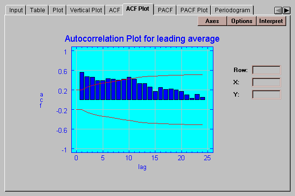
The height of each bar shows the magnitude of the autocorrelation at a selected lag. The red lines are 95% probability limits centered at 0. An estimate outside the limits would allow us to reject the hypothesis that the autocorrelation at that lag is equal to 0. In this case, the autocorrelations show a slowly decreasing pattern, with the first 10 lags all beyond the 95% limits. This is indicative of a nonstationary series in which the mean has changed over the sampling period.
Specify the maximum lag to be included on the table and the confidence level for the probability intervals:
This tab creates a table displaying the sample partial autocorrelation coefficients:
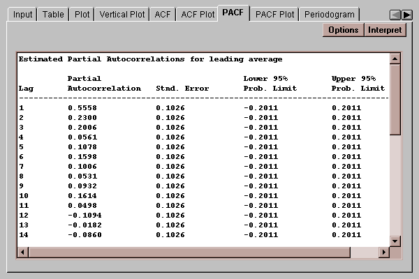
The partial autocorrelation at lag k measures the correlation between values of the time series separated by k time units, accounting for any correlation at lower lags. In building ARIMA models, it is used to indicate the order of autoregressive model needed to describe the data. The partial autocorrelations are shown together with their standard errors, which are in turn used to calculate the probability limits. Any partial autocorrelation outside the 95% probability limits is significantly different from zero at the 5% significance level.
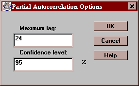
Specify the maximum lag to be included on the table and the confidence level for the probability intervals:
This tab plots the sample partial autocorrelation coefficients with probability limits:
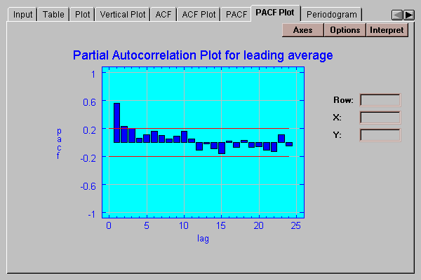
The height of each bar shows the magnitude of the partial autocorrelation at a selected lag. The red lines are 95% probability limits centered at 0. An estimate outside the limits would lead us to reject the hypothesis that the partial autocorrelation at that lag is equal to 0.
Specify the maximum lag to be included on the table and the confidence level for the probability intervals:
This tab displays the sample periodogram and cumulative (integrated) periodogram:
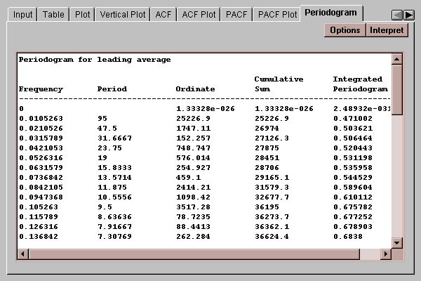
When the time series of interest has periodic components in it, i.e., fluctuations which repeat at regular frequencies, it can be instructive to express the time series as a sum of sines and cosines with different frequencies. It is well-known that any time series can be expressed as the sum of n/2 sine waves at frequencies corresponding to one cycle over the sampling period, two cycles, three cycles, and so on (called the Fourier frequencies). If the time series is random, the periodogram will be constant at all frequencies (to within normal sampling error). If it contains a strong trend, the low frequency terms will dominate.
The periodogram actually performs an analysis of variance by frequency. Summing the periodogram ordinates yields the total corrected sum of squares ordinarily displayed in an ANOVA table. In the above table, the rightmost column displays the cumulative sum of the ordinates divided by that total. It is used to help determine whether the time series is random in the Integrated Periodogram plot.
Specify options for periodogram:
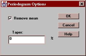
Remove mean - if checked, the sample mean is first subtracted from the data before the periodogram ordinates are computed. If this is not done, a large spike at lag 0 normally results.
Taper - if desired, a cosine-bell taper may be used to adjust a given percentage of the values at both end sof the time series. This is sometimes done to reduce end effects.
This tab plots the periodogram ordinates:
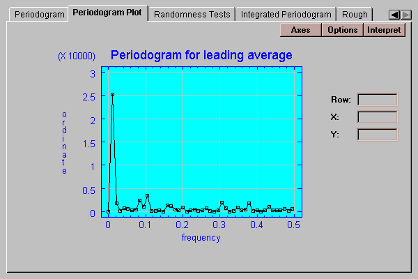
The periodogram is described in the previous section. In this case, the large spike is caused by the trend in the time series.
Specify options for periodogram:
Remove mean - if checked, the sample mean is first subtracted from the data before the periodogram ordinates are computed. If this is not done, a large spike at lag 0 normally results.
Taper - if desired, a cosine-bell taper may be used to adjust a given percentage of the values at both ends of the time series. This is sometimes done to reduce end effects.
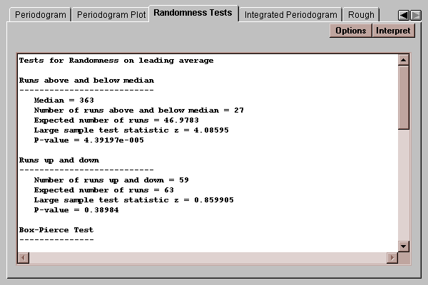
This tab shows the results of three tests used to determine whether or not the time series is random:
A random time series is a sequence of random numbers with no inherent dynamic structure or autocorrelation. If a time series is random, standard statistical techniques may be applied to it. Otherwise, the autocorrelations must be taken into account.
Three tests are performed:
Runs above and below median - counts the number of times that the time series rises above or below the sample median and compares that to the value expected for a random sequence of numbers.
Runs up and down- counts the number of times that the time series rises or falls and compares that to the value expected for a random sequence of numbers.
Box-Pierce test - calculates the first k lagged autocorrelations and calculates a statistic which follows a chi-squared distribution.
Each test calculates a P-value. A P-value below 0.05 would lead us to reject the hypothesis that the time series is random at the 5% significance level.
In this case, the test for runs above and below the median strongly rejects the hypothesis that the time series is random.
Specify the number of terms to be used in the Box-Pierce test:
This tab plots the integrated periodogram:
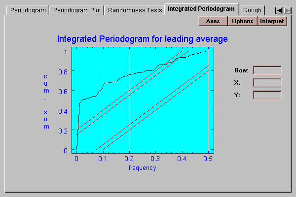
Included on the plot are 90% and 95% Kolmogorov-Smirnov bounds. If the plotted function remains within those bounds, we cannot reject the hypothesis that the series is random at the 10% and 5% significance levels, respectively. In this case, the function does not stay within the bounds, implying the time series had significant dynamic components in it.
Specify options for periodogram:
Remove mean - if checked, the sample mean is first subtracted from the data before the periodogram ordinates are computed. If this is not done, a large spike at lag 0 normally results.
Taper - if desired, a cosine-bell taper may be used to adjust a given percentage of the values at both ends of the time series. This is sometimes done to reduce end effects.
This tab plots the "rough", which is the difference between the original time series values and the result of a smoother applied to them:
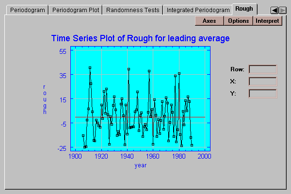
The desired smoother is selected by pressing the Options button.
Select one or two smoothers to apply to the data:
For a discussion of smoothing, see the section on time sequence Plots.