This statlet creates plots and other statistics for data arranged in two-way tables. Such data frequently arise from cross-tabulations, in which cases are classified according to two non-quantitative factors. The tabs are:
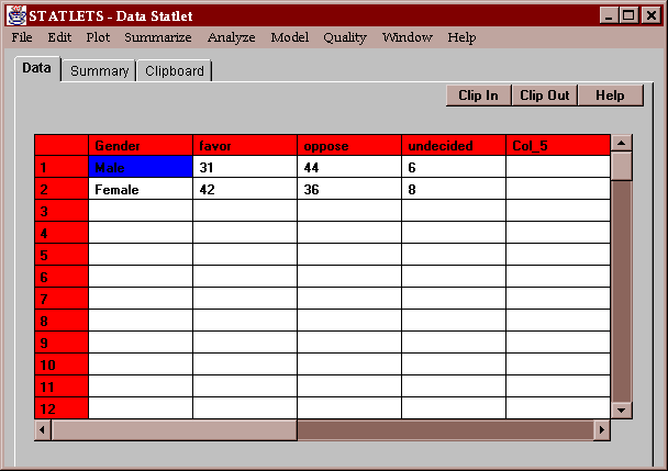
The sample data for this statlet consists of a table with two rows and four columns:
The data represent the response to a question asked of 167 individuals. The table shows the number of individuals responding in each of three ways (favor, oppose, and undecided) cross-classified by their gender.
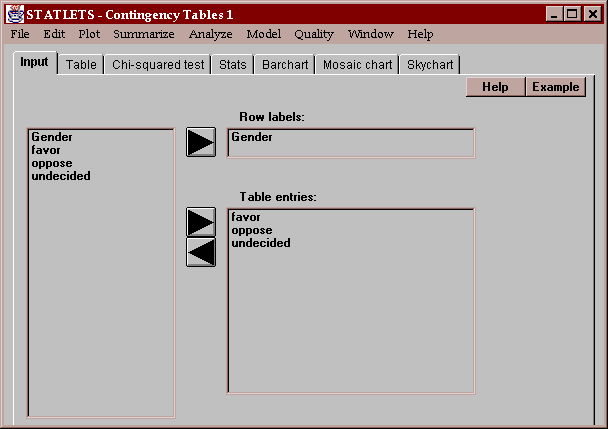
In order to analyze data arranged in a two-way table, you should create one column with row labels and additional columns for the contents of the table.
The above example enters data which would logically be arranged in a table as shown below:
Number favoring Number opposed Number undecided Male 31 44 6 Female 42 36 8
The table entry columns must contain integer data greater than or equal to 0.
This tab displays the two-way table:
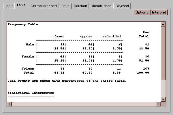
Each cell of the table shows two values: a count and a percentage. By default, the percentages displayed show the fraction of the entire table represented by each cell, although this may be changed using the Options button as discussed below. Also shown are row, column and table totals.
The Options button allows you to specify how the cell percentages in the table are computed:
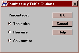
You may select:
Tablewise - percentages are computed based on the total count in the table.
Rowwise - percentages are computed based on the row totals.
Columnwise - percentages are computed based on the column totals.
This tab performs a chi-squared test to test the hypothesis that the row and column classifications are independent. It displays the calculated test statistic and an associated P-value:
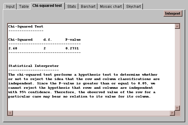
If the P-value falls below a critical value such as 0.05, the hypothesis of independence between rows and columns is rejected at the corresponding significance level. In this case, since the P-value is greater than 0.05, the hypothesis of independence cannot be rejected, implying that there is no significant difference between how men and women respond to the example question.
This tab displays various statistics calculated from the data in the two-way table:
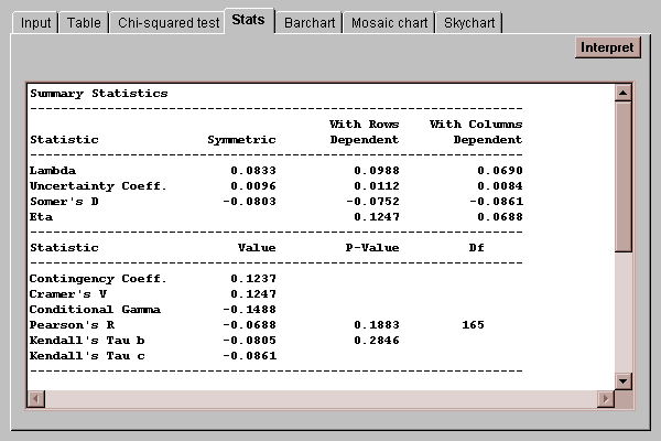
Each of the statistics is designed to measure the degree of association between the row and column classifications. For example, lambda measures (on a scale of 0 to 1) the extent to which knowledge of the row or column an individual falls in helps predict the other classification. While a full discussion of these statistics is beyond the scope of this manual, their definitions may be found in the Glossary.
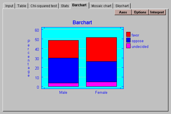
The data in the table may be displayed as a barchart. The default format displays a set of clustered bars for each row of the table:

Various other formats for the chart may be selected by pressing the Options button:
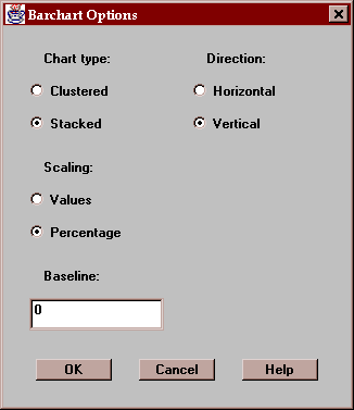
These include:
Chart type - the bars may be clustered side-by-side or stacked on top of one another.
Scaling - the scaling may show either the class values or the class percentages.
Direction - the bars may be oriented in the horizontal or vertical direction.
Baseline - this specifies the numeric value from which the bars are drawn. If greater than the smallest bar, bars may extend below the baseline.
An interesting variation with percentages and stacked bars is shown below:
This tab displays a slight modification of the bar chart:
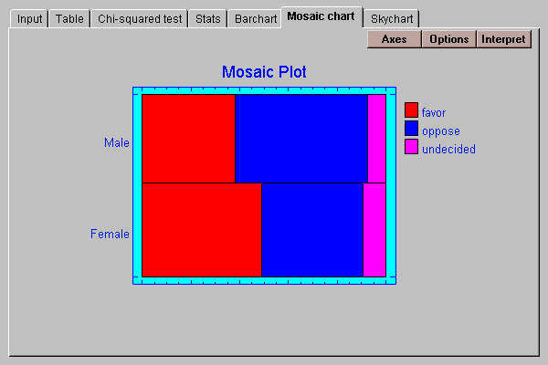
In this display, the vertical dimension of the bars is scaled according to the percentage of observations in each row. The length of the bars is then divided according to the percentage distributions amongst the columns within each row. The result is a display in which the area of each small bar is proportional to the count in the associated cell of the table.
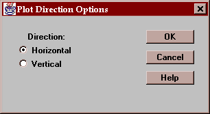
You may elect to draw the bars in either a horizontal or vertical direction:
This tab displays a three-dimensional representation of the counts in the table:
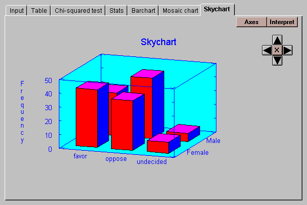
The heights of the bars are proportional to the cell counts.