This statlet creates two common types of business charts: bar charts and pie charts. The input data consists of values for up to 16 classes. The Tabulation statlet also creates bar charts and pie charts, but it does so by counting the frequency of occurrence of different values in a data column.
This statlet has four tabs:
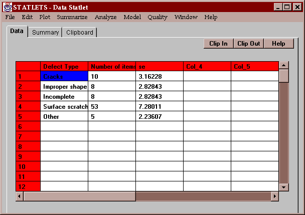
The example for this statlet consists of information about a set of defective items. Each item has been classified by the type of defect, which has been grouped into 5 classes as shown below:
Each row contains information about a class: a name, a count, and a standard error. The last column is optional.
The input panel for this statlet is shown below:
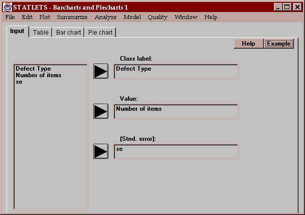
Column names must be placed into the "Class label" and "Value" fields. The Value field must contain non-negative numeric data, which is used to define the length of the bars and the size of the pie slices. The Standard error field is optional. If a column name is entered, it must also contain non-negative numeric data. The standard error values are used to draw error bars on the bar charts.
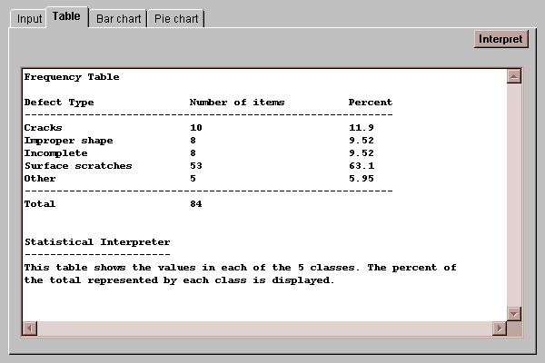
This tab shows the number of items in each class and the percentage which that class represents of the total:
This tab draws bars with length proportional to the class values:
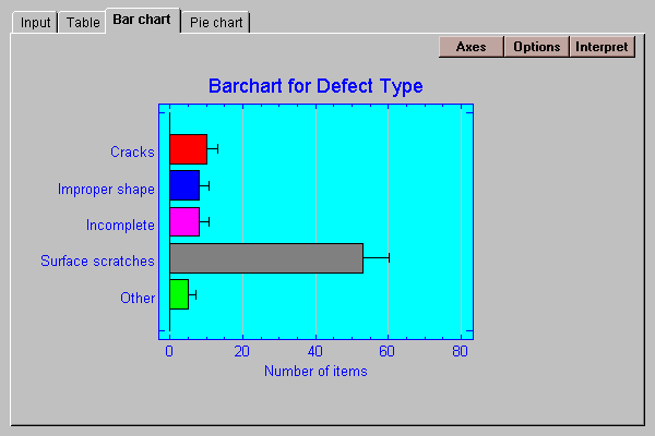
If standard errors are entered, error bars are drawn to the class value plus the standard error as shown above.
The Options button allows you to change various aspects of the plot:
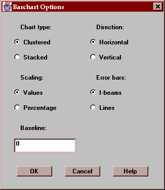
These include:
Chart type - the bars may be clustered side-by-side or stacked on top of one another.
Scaling - the scaling may show either the class values or the class percentages.
Direction - the bars may extend in either the horizontal or vertical direction.
Error bars - the standard error bars may be drawn as I-beams or straight lines.
Baseline - this specifies the numeric value from which the bars are drawn. If greater than the smallest bar, bars may extend below the baseline.
This tab draws a pie chart with slices which are sized proportionally to the class values:
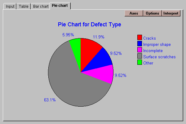
From such a chart, it is easy to identify the dominant class or classes.
The Options button allows you to change various aspects of the plot:
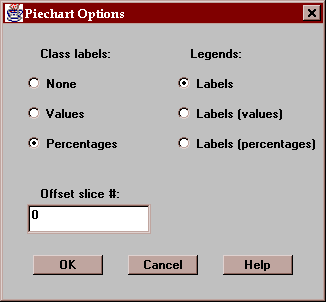
These include:
Class labels - labels drawn by each slice may show the class values, percentages, or neither.
Legends - the legend block at the right of the plot may show the class labels, labels with values, or labels with percentages.
Offset slice # - if desired, specify a single slice to be offset from the rest of the pie. Slices are numbered in a clockwise direction starting at 12:00 o'clock.