This statlet constructs control charts for the average number of defects per item in a group. The tabs are:
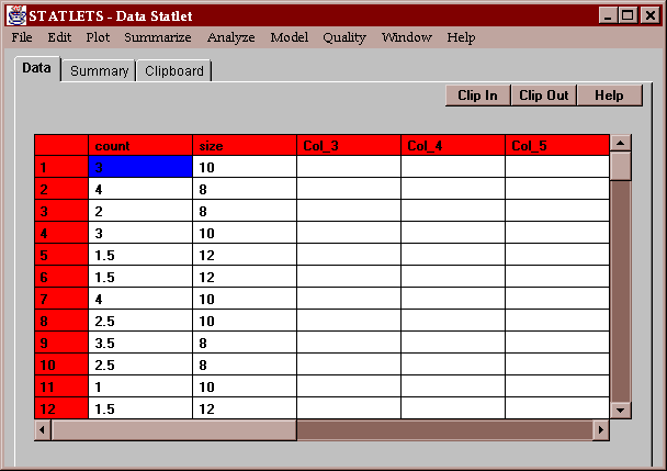
The example data consists of 30 subgroups, with group sizes ranging from 8 to 12 items. The average number of defects in each group is specified, together with the number of items:
Two columns must be specified, containing the average number of defects per item in each group and the group sizes:
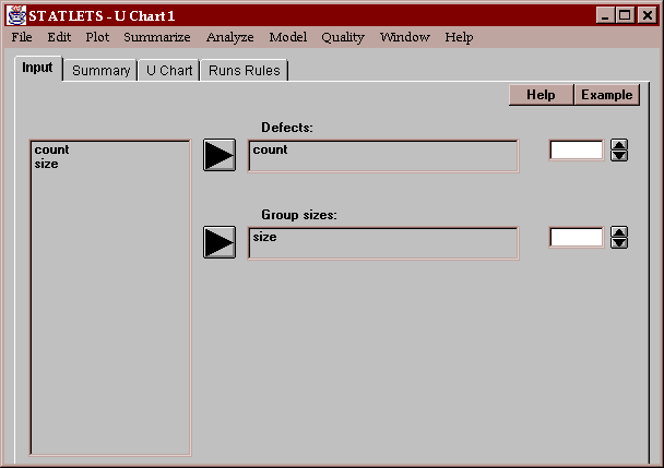
The group sizes need not all be the same.
This tab summarizes the results of the U chart:
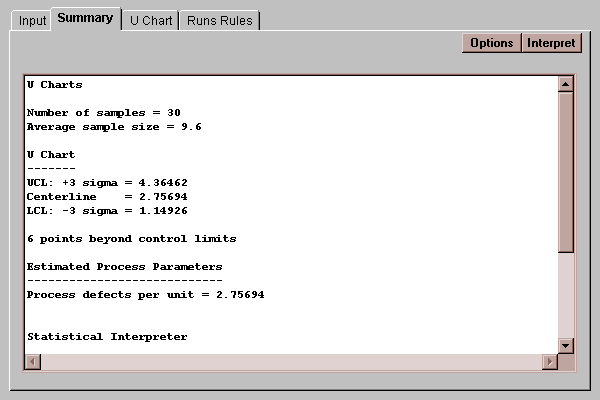
The process parameters are estimated by
process defects per unit = U-bar
where U-bar is the average of the subgroup defects per unit (weighted average if the subgroup sizes are different).
The Options button generates a dialog box allowing you to specify how the control limits should be computed:
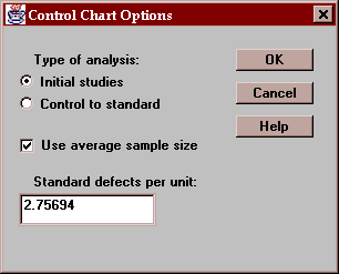
Settings include:
Type of analysis - either "Initial studies", in which the data determine where the control limits are placed, or "Control to standard", which uses the specified standard defects per unit to set the limits.
Use average sample size - for data from subgroups of different sizes, whether the control limits should be based on the average sample size or the individual subgroup sizes.
The Initial studies mode is commonly used to determine whether or not a process is in a state of statistical control and to determine control limits for monitoring the process in the future. The Control to standard mode is most often used in real-time to monitor a process against pre-established limits.
This chart plots the average number of defects per item with 3-sigma control limits:
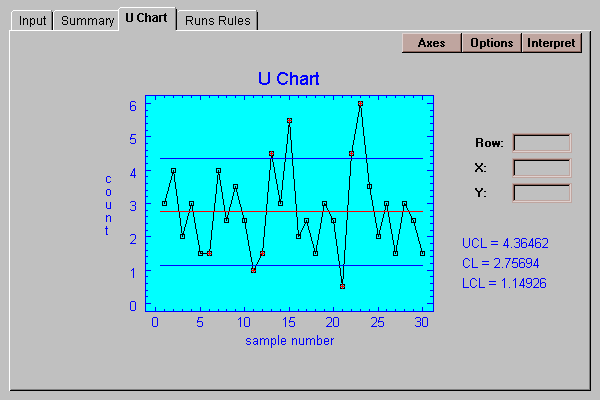
The lines are located at:
upper control limit: U + 3*[U/n]1/2
center line: U
lower control limit: U - 3*[U/n]1/2
where U=U-bar if in "Initial studies" mode or the specified process defects per unit if in "Control to standard" mode, and n is the subgroup size (or average subgroup size).
Any points outside the 3-sigma control limits are highlighted in red. In addition, any points which violate the Runs rules described below are also highlighted.
You can specify various aspects of the control chart by pressing the Options button:
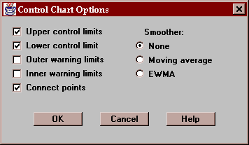
These include:
Upper control limit - if checked, an upper control limit is included on the chart.
Lower control limit - if checked, a lower control limit is included on the chart.
Outer warning limits - if checked, warning limits are drawn at the centerline +/- 2 sigma.
Inner warning limits - if checked, warning limits are drawn at the centerline +/- 1 sigma.
Connect points - if checked, lines are drawn connecting each of the points on the chart.
Smoother - you may superimpose a moving average or exponentially weighted moving average (EWMA) on the chart. These smoothers are used to help estimate any trend which might be present in the data. They may also be drawn separately using the MA and EWMA tabs. When drawn here, they use the settings of those tabs.
This tab lists any unusual groups of points on the chart:
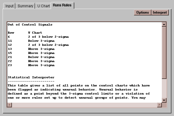
For a detailed discussion of runs rules, refer to the Individuals Chart statlet.