This statlet performs an analysis of variance for data grouped by levels of two or more crossed classification factors. The tabs are:
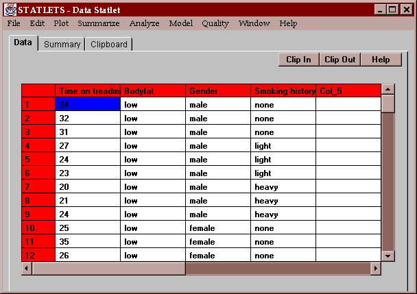
The sample data contain results of a treadmill test given to 48 subjects. The 48 subjects were classified as:
The number of minutes it took each of the subjects to reach a pre-defined level of stress forms the data to be analyzed:
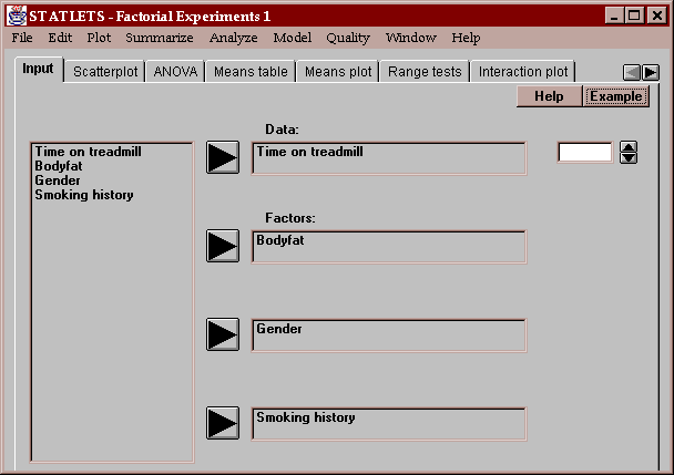
Enter the name of the column containing the data to be analyzed, and the names of columns contains level codes for the experimental factors:
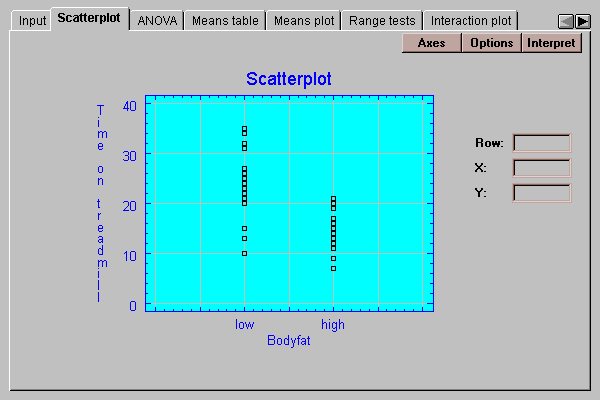
This tab shows a plot of the data values by level of a selected factor:
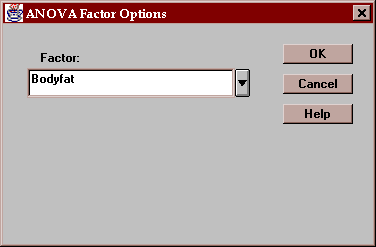
Press this button to select the factor to be plotted on the X-axis:
This tab displays an analysis of variance table for the data:
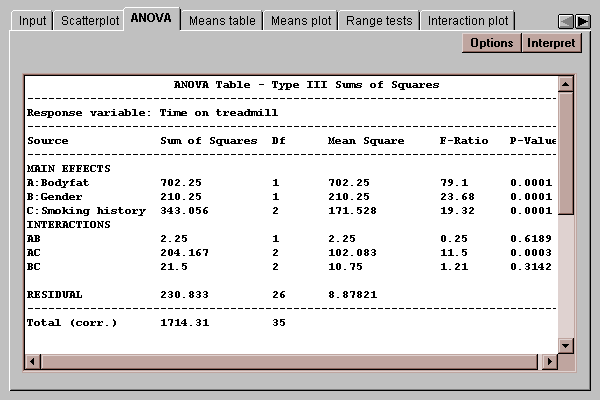
The table takes the original variability among the data values and divides it into various components:
The P-values in the rightmost column of the table are used to determine whether significant differences exist due to the factors, and whether or not there are significant interactions. P-values below 0.05 indicate statistically significant effects at the 5% significance level. In the above example, there are significant differences due to all of the main effects and a significant interaction between factor A (level of bodyfat) and factor C (smoking history).
Use the Options button to specify whether you wish to have the interactions included in the analysis of variance table:
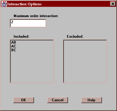
Indicate:
Maximum order interaction - the highest order interaction to be considered. By default, only two-factor interactions are included.
Included - this list shows the interactions to be included in the ANOVA table. Clicking on any interaction moves it to the Excluded list.
Excluded - this list shows the interactions to be excluded from the ANOVA table. Clicking on any interaction moves it to the Included list.
This tab displays the means for each level code together with uncertainty intervals:
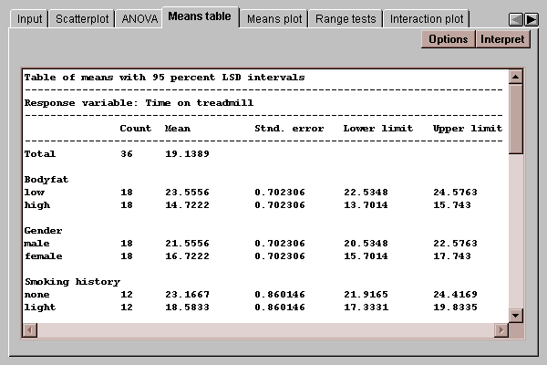
It also shows the means at different combinations of the factors:
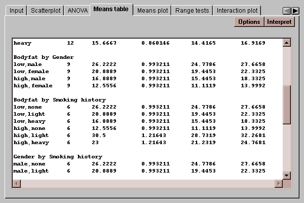
The uncertainty intervals bound the estimation error in the means using one of several methods, selected by pressing the Options button. The choice of intervals is described in detail in the Oneway ANOVA statlet.
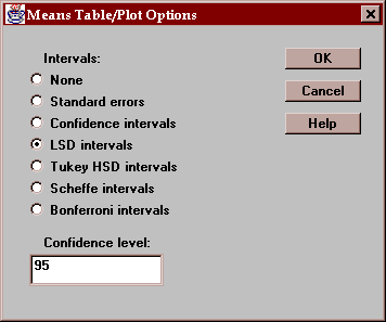
Select the desired type of uncertainty intervals:
This tab plots the level means with uncertainty intervals:
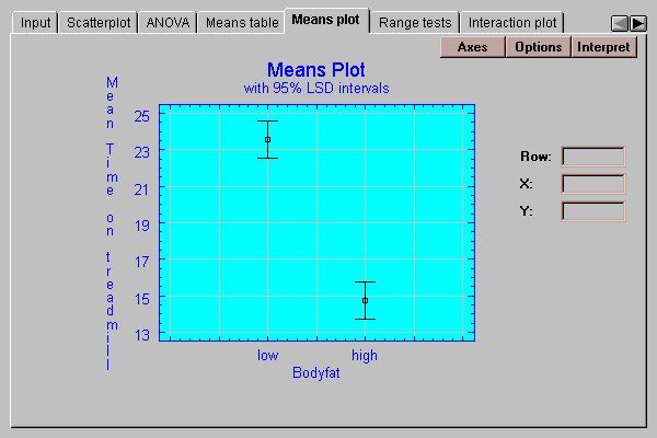
See the discussion under Means table for an explanation of the intervals.
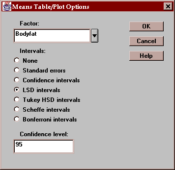
Select the factor to plot on the X-axis and the desired type of uncertainty intervals:
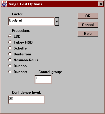
This tab indicates which means are significantly different from which others:
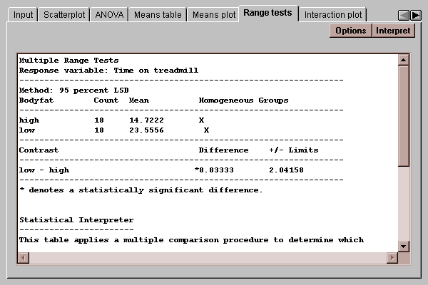
The output of this tab is described in the Oneway ANOVA statlet.
Select the desired factor, procedure, and level of confidence:
This tab may be used to illustrate any significant interaction:
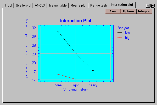
It plots the least squares means for each combination of the factors. If the factors do not interact, the lines should be approximately parallel. In this case, the strong interaction between bodyfat and smoking history is quite apparent, with smoking having a much more significant effect on individuals with a low level of bodyfat.
Use this button to select the interaction to be plotted:
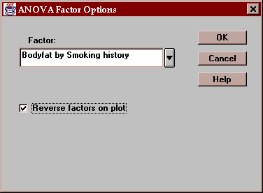
If the "Reverse factor on plot" box is checked, the second factor (Smoking) will be plotted along the X-axis. Otherwise, the factor before the "by" will be plotted along the X-axis.
This tab plots the residuals by level code:
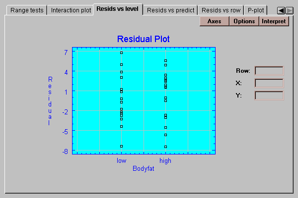
If the standard deviations within each group are the same, we should see approximately the same scatter amongst the residuals for each level. We don’t usually start to worry, however, until the standard deviations differ by more than a factor of 3 to 1 between the largest and the smallest. The analysis of variance is known to be reasonably robust at differences of less than this magnitude, which means that the confidence levels stated are approximately correct.
This tab plots the residuals versus predicted values of strength:
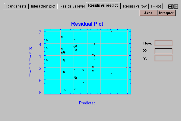
It is useful for detecting possible violations of the assumption of constant within group variability. Frequently, the variability of measurements increases with their mean. If so, the above plot would show points falling into a funnel-shaped pattern, increasing in spread from left to right. Such observed heteroscedasticity may often be eliminated by analyzing the logarithms of the data rather than the original data values.
This tab plots the residuals versus row number:
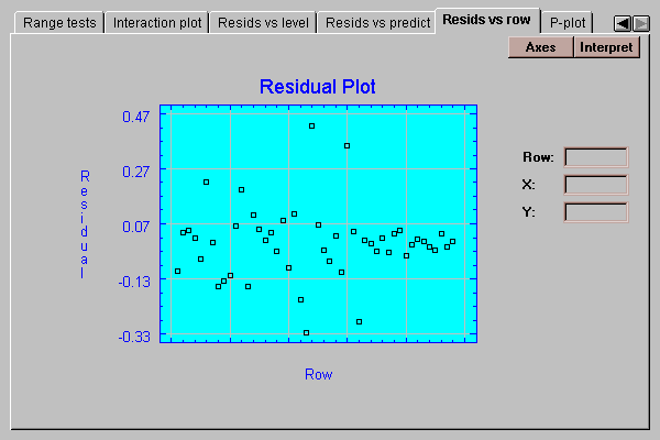
If the data were entered in time order, any pattern in the above plot would indicate changes over the course of the data collection.
This tab creates a normal probability plot for the residuals:
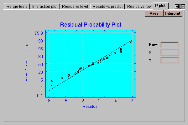
If the residuals come from a normal distribution, the points should lie approximately along a straight line as shown above.