This statlet takes two columns of numeric or non-numeric data and builds a table showing the frequency of occurrence of all pairs of values in the two columns. It calculates various statistics for the resulting contingency table and performs a chi-squared test for independence of rows and columns. It also displays the data graphically in several different ways. The tabs are:
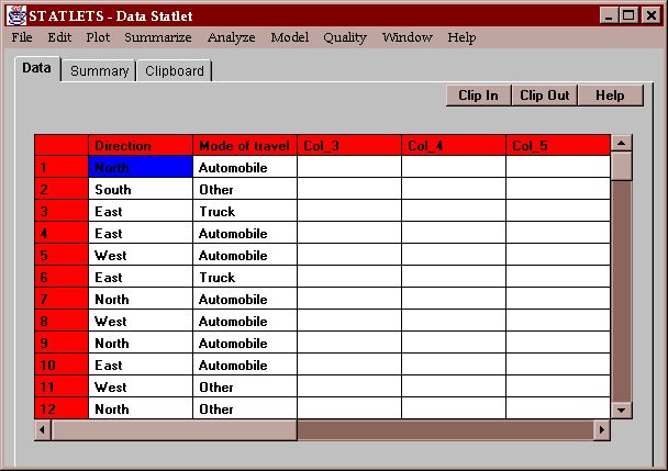
The sample data set for this statlet contains two columns of non-numeric data:
The columns specify the direction of travel and type of vehicle driven by a sample of commuters passing through a busy intersection.
Enter the names of two columns containing numeric or non-numeric values:
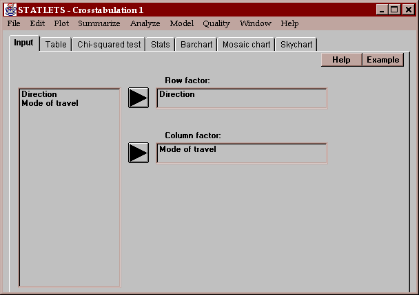
The unique values found in the first column are used to define the rows of a two-way table. The unique values found in the second column are used to define the columns.
This tab displays a two-way table showing the frequency of occurrence of all pairs of values:
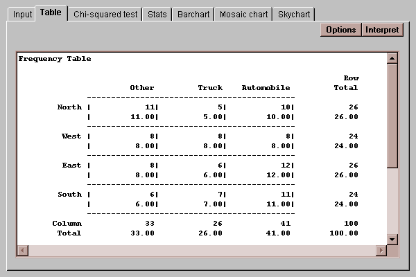
Each cell of the table shows two values: a count and a percentage. The count shows how many times each pair of values occurred. By default, the percentages displayed show the fraction of the entire table represented by each cell, although this may be changed using the Options button as discussed below. Also shown are row, column and table totals.
The Options button allows you to specify how the cell percentages in the table are computed:
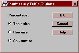
You may select:
Tablewise - percentages are computed based on the total count in the table.
Rowwise - percentages are computed based on the row totals.
Columnwise - percentages are computed based on the column totals.
This tab performs a chi-squared test to test the hypothesis that the row and column classifications are independent. It displays the calculated test statistic and an associated P-value:
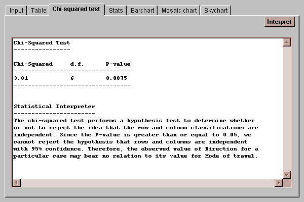
If the P-value falls below a critical value such as 0.05, the hypothesis of independence between rows and columns is rejected at that significance level. In this case, since the P-value is greater than 0.05, the hypothesis of independence cannot be rejected, implying that there is no significant difference in the distribution of vehicle types amongst different directions of travel.
This tab displays various statistics calculated from the data in the two-way table:
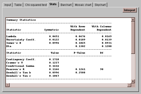
Each of the statistics is designed to measure the degree of association between the row and column classifications. For example, lambda measures (on a scale of 0 to 1) the extent to which knowledge of the row or column an individual falls in helps predict the other classification. While a full discussion of these statistics is beyond the scope of this manual, their definitions may be found in the Glossary.
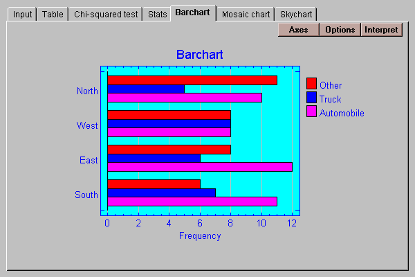
The data in the table may be displayed as a barchart. The default format displays a set of bars for each row of the table:
Various other formats for the chart may be selected by pressing the Options button:
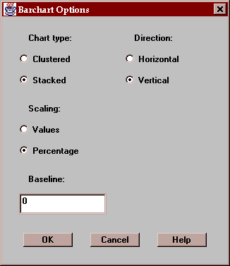
These include:
Chart type - the bars may be clustered side-by-side or stacked on top of one another.
Scaling - the scaling may show either the class values or the class percentages.
Direction - the bars may extend in the horizontal or vertical direction.
Baseline - this specifies the numeric value from which the bars are drawn. If greater than the smallest bar, bars may extend below the baseline.
This tab displays a slight modification of the bar chart:
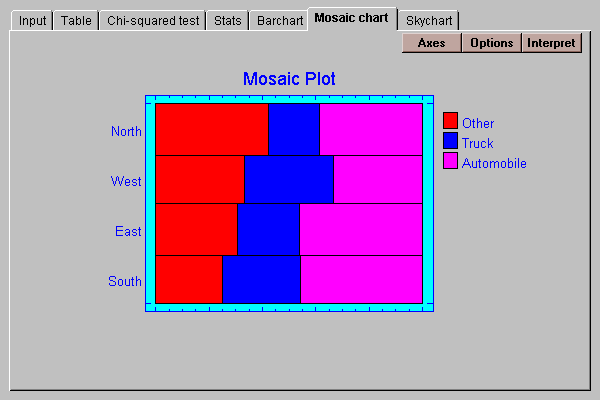
In this display, the vertical dimension of the bars is scaled according to the percentage of observations in each row. The length of the bars is then divided according to the percentage distributions amongst the columns within each row. The result is a display in which the area of each small bar is proportional to the count in the associated cell of the table.
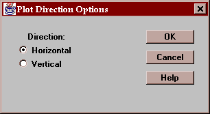
You may draw the bars in either a horizontal or vertical direction:
This tab displays a three-dimensional representation of the counts in the table:
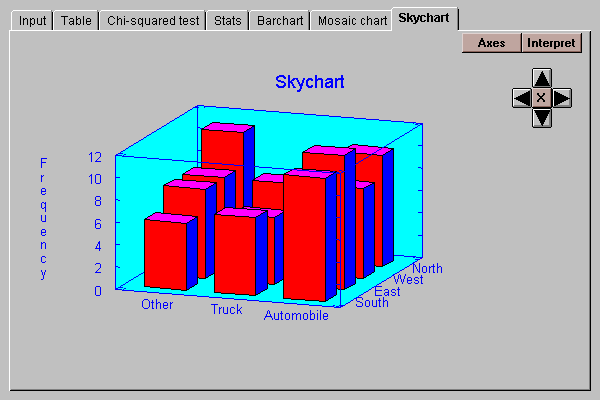
The heights of the bars are proportional to the cell counts.