This Statlet creates scatterplots for a single column of numeric data. The tabs are:
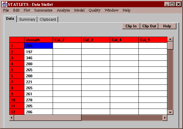
A sample of measured breaking strengths for 100 glass bottles sampled once every 15 minutes from a manufacturing process provides the example data for this statlet:
The input panel requests the name of a single column of numeric data:
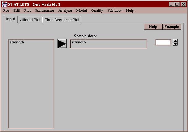
It may be transformed if desired.
This tab creates a scatterplot of the observations in the "Sample data" column:
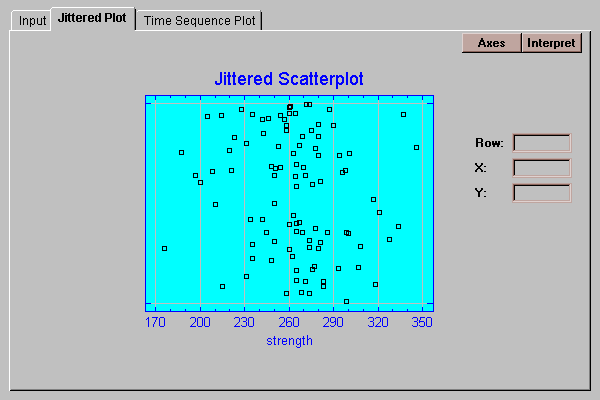
This plot is most useful for illustrating the individual data values, so that you can see where the regions of highest density lie and whether any outliers might be present. The horizontal axis covers the range of the data, while the vertical axis has no real meaning. Instead, the data have been jittered in the vertical direction. Jittering adds a random offset to each data value in order to avoid extensive overplotting.
On most scatterplots in STATLETS, you may click on a point to determine its location. When you do, it will be colored in red as shown above and the row number and location of the point displayed. If you click at a spot on the graph where no point is located, the X-Y coordinates of the mouse cursor will be displayed instead.
This tab creates a plot of the data versus their row number:
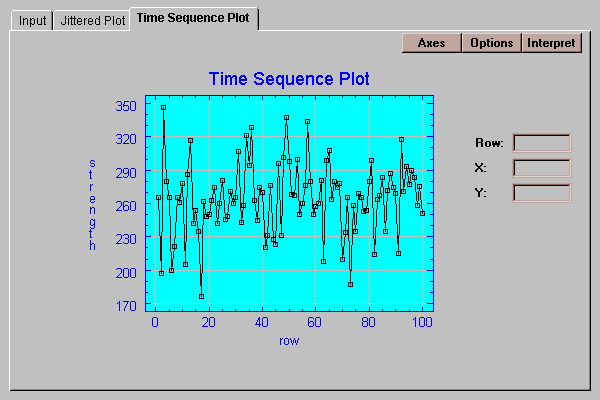
Any missing values will be ignored.
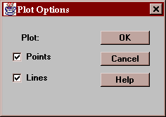
The options dialog box allows you to select whether you wish to plot point symbols, lines, or both:
If you press the "Axes" button at the top of any graphics panel, the following dialog box will be displayed:
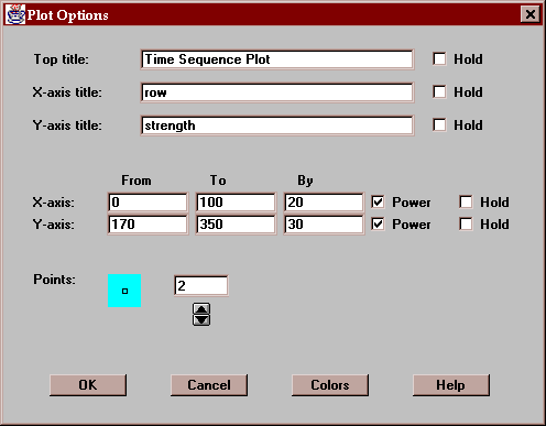
The top of the plot allows you to change the axis titles, while the center of the box allows you to change the axis scaling. The "Power" boxes determine whether axis scaling will include a notation simlar to "(X 1000)" for very large or very small numbers.
Unless the checkboxes labeled "Hold" are checked, any changes to titles or scaling will only remain in effect until the input data is changed. If you check a "Hold" box, the settings will remain as shown even if the data changes.
You may also change the size of the points on the plot by clicking on the spinner near the bottom of the dialog box.
The button labeled "Colors" at the bottom of the above dialog box will display the box shown below:
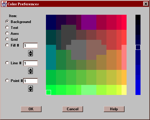
To change the color of any item, press the button for that item and click on the desired color. Colors are set based on an RGB (red-green-blue) scale. The main section of the box displays available colors where the level of Green changes along the vertical axis and the level of Red changes along the horizontal axis. The rightmost column sets the level of Blue. If you click on a different position along the blue scale, the Red-Green section of the box will change. The colors apply to all graphs and remain set until the end of the session.