- Bar Graph
- Pie Chart
- Frequency Table
- Stemplot
- Histogram
- Boxplot
- Scatterplot
- Timeplot
- Summary Statistics
- Motion Charts
- Geo-Map
- Geo-Chart
Type of Data: Qualitative (Categorical)
DATA FILE: Data file should be in a table format as follows:
GENERAL FORM OF R COMMAND: barplot(dataframename$Count, EXAMPLE: Dataset: oscar.csv The table gives age (years) of the best actress and actor when Oscar was won. Click on the file to download it and move it into RStudio. We will produce the barplot for the actresses.
barplot(oscar$ActressCount, names.arg=oscar$Age)
|
|
Type of Data: Qualitative (Categorical)
DATA FILE: Data file should be in a table format as follows:
GENERAL FORM OF R COMMAND: pie(dataframename$Count, EXAMPLE: Dataset: oscar.csv The table gives age (years) of the best actress and actor when Oscar was won. Click on the file to download it and move it into RStudio. We will produce the barplot for the actresses.
pie(oscar$ActressCount, labels=oscar$Age)
|
|
Type of Data: Qualitative (Categorical)
DATA FILE: Each individual has been categorized to one of the levels. GENERAL FORM OF R COMMAND: variablename.freq = table(variablename) EXAMPLE: Dataset: painters (Located in library MASS) The data frame is a compilation of technical information of a few eighteen century classical painters. The data set belongs to the MASS package, and has to be pre-loaded into the R workspace prior to its use. library(MASS) We will construct the frequency distribution of the school variable school.freq = table(painters$School) school.freq EXERCISE: Produce a barplot and pie chart for the school categorical variable. |
|
Type of Data: Quantitative (Numerical)
GENERAL FORM OF R COMMAND: stem(dataframename$variablename) EXAMPLE: Dataset: faithful There are two observation variables in the data set. The first one, called eruptions, is the duration of the geyser eruptions. The second one, called waiting, is the length of waiting period until the next eruption. We will create a stem-and-leaf plot of the eruptions variable. stem(faithful$eruptions) The decimal point is 1 digit(s) to the left of the | |
Type of Data: Quantitative (Numerical)
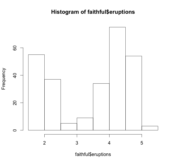
GENERAL FORM OF R COMMAND: hist(dataframename$variablename) EXAMPLE: Dataset: faithful There are two observation variables in the data set. The first one, called eruptions, is the duration of the geyser eruptions. The second one, called waiting, is the length of waiting period until the next eruption. We will create a histogram of the eruptions variable. hist(faithful$eruptions)
|
Type of Data: Quantitative (Numerical)
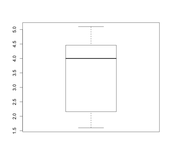
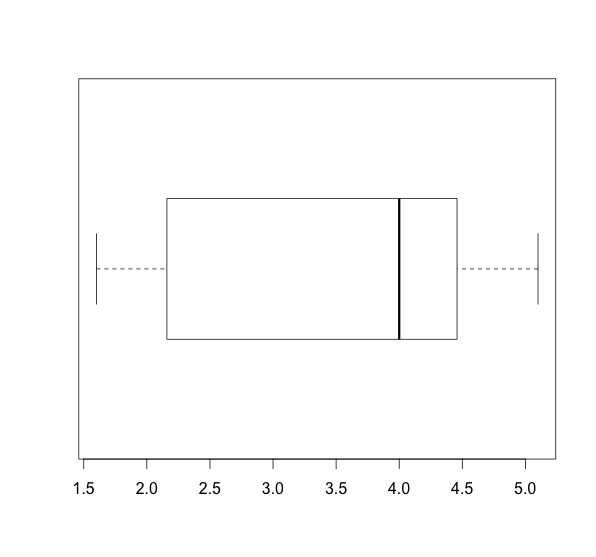
GENERAL FORM OF R COMMAND: boxplot(dataframename$variablename) EXAMPLE: Dataset: faithful There are two observation variables in the data set. The first one, called eruptions, is the duration of the geyser eruptions. The second one, called waiting, is the length of waiting period until the next eruption. We will create a boxplot of the eruptions variable. boxplot(faithful$eruptions)
|
For side-by-side boxplot (separate columns) GENERAL FORM OF R COMMAND: boxplot(dataframename$variablename1, dataframename$variablename2, ...) For side-by-side boxplot (grouping variable) GENERAL FORM OF R COMMAND: boxplot(dataframename$variablename~groupingvariablename)
|
Type of Data: Quantitative (Numerical)
GENERAL FORM OF R COMMAND: plot(ExplanatoryVariable, ResponseVariable, main="The Title of the Plot", xlab="Definition of the Explanatory Variable", ylab="Definition of the Response Variable") EXAMPLE: Dataset: faithful There are two observation variables in the data set. The first one, called eruptions, is the duration of the geyser eruptions. The second one, called waiting, is the length of waiting period until the next eruption. We will create a scatter plot of the waiting intervals (response) versus eruption durations (explanatory) plot(faithful$eruptions, faithful$waiting) To add a title and label the axes plot(faithful$eruptions, faithful$waiting, To add a least squares regression line abline(lm(faithful$waiting~faithful$eruptions)) To add any line with intecept a and slope b you can use abline(a,b) Therefore, if you would like to plot y=x, use abline(0,1) |
Type of Data: Quantitative (Numerical) Time series data
DATA FILE: Data file should have a time column and variable. GENERAL FORM OF R COMMAND: plot(dataframename$timevariable, dataframename$variable, xlab=" ", ylab=" ", type="l", col="red") l stands for line plot. See the video if you have a date as the time variable EXAMPLE: Dataset: LungCancer.csv The data consists of Year of diagnosis, incidence rates (out of 100,000 people) for Total popultaion, Males, and Females. Click on the file to download it and move it into RStudio. We will produce the timeplot for the total. plot(LungCancer$Year, LungCancer$Total, xlab="Year", ylab="Total Lung Cancer Rate", type="l", col="red") EXERCISE: Produce a timeplot for females and males separately and compare. |
Type of Data: Quantitative (Numerical)
GENERAL FORM OF R COMMAND: 5-number Summary summary(dataframename$variablename) Mean mean(dataframename$variablename) Median median(dataframename$variablename) Interquartile Range IQR(dataframename$variablename) Standard Deviation sd(dataframename$variablename) EXAMPLE: Dataset: faithful There are two observation variables in the data set. The first one, called eruptions, is the duration of the geyser eruptions. The second one, called waiting, is the length of waiting period until the next eruption. We will create a histogram of the eruptions variable. summary(faithful$eruptions)
|
Type of Data: Quantitative (Numerical) Time series data with identifier
DATA FILE: Data file should have
PACKAGE: googleVis GENERAL FORM OF R COMMAND: library(googleVis) dataframename <- read.csv(file.choose(), header = T) attach(dataframename) namemotion <- gvisMotionChart(dataframename, idvar = 'name of Identifying variable', timevar = 'name of time variable') plot(namemotion) EXAMPLE: Dataset: MinnesotaData.csv The data gives various population characteristics on Minnesota Counties from 1900 to 2010. Click on the file to download it and move it into RStudio. We will produce a motion chart for this data. To see the detailed instructions click here. library(googleVis) county<- read.csv(file.choose(), header=TRUE) attach(county) countyMotion<- gvisMotionChart(county, idvar='County', timevar='Year') plot(countyMotion) |
Type of Data: Quantitative (Numerical)
DATA FILE: Data file should have
PACKAGE: googleVis GENERAL FORM OF R COMMAND: library(googleVis) dataframename <- read.csv(file.choose(), header = T) attach(dataframename) namegeoMap<- gvisGeoMap(dataframename, locationvar = '', numvar = '', hovervar = '', options = list()) plot(namegeoMap) EXAMPLE: Dataset: alcohol.csv The data gives 2008 alcohol consumption per person for 182 countries. Click on the file to download it and move it into RStudio. We will produce a map this data. To see the detailed instructions click here. library(googleVis) alcohol<- read.csv(file.choose(), header=TRUE) attach(alcohol) alcoholgeoMap<- gvisGeoMap(alcohol, locationvar = 'Country', numvar = 'Alcohol') plot(alcoholgeoMap)
|
|
Type of Data: Any
DATA FILE: Data file should have
PACKAGE: googleVis GENERAL FORM OF R COMMAND: library(googleVis) dataframename <- read.csv(file.choose(), header = T) attach(dataframename) namegeoChart<- gvisGeoChart(dataframename, locationvar = "", colorvar = "", sizevar = "", hovervar = "", options = list()) plot(namegeoChart) EXAMPLE: Dataset: lifeexpectancy2009.csv The data gives 2009 life expectancies for the 197 countries. Click on the file to download it and move it into RStudio. We will produce a map/chart of this data. Our location variable is Country and color variable is Life_Expectancy. library(googleVis) lifeexpectancy<- read.csv(file.choose(), header=TRUE) attach(lifeexpectancy) lifeexpectancyChart<- gvisGeoChart(lifeexpectancy, "Country", "Life_Expectancy") plot(lifeexpectancyChart) If you would like to be able to edit the chart use lifeexpectancyChartedit<- gvisGeoChart(lifeexpectancy, "Country", "Life_Expectancy", options = list(gvis.editor = "Editor")) plot(lifeexpectancyChartedit) |
Click here to see the geo-chart |