![]()
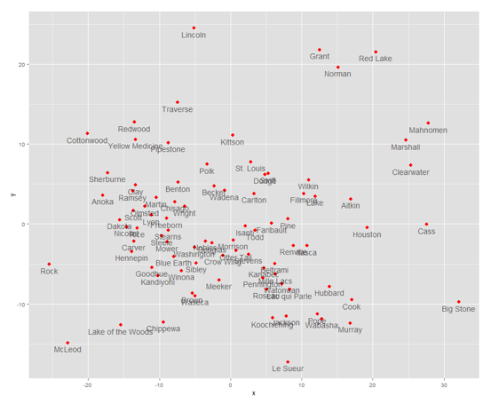
We produce this Non
metric MDS based on the 2012 data: % single parent households, access to
recreational, %limit access to healthy food, % fast food restaurant in order to
see the relationship whether children with single parent will eat junk food or
have no recreational life. The points spread out of the cluster( at the edge of graph) are counties with no
recreational(maybe missing data) – “Grant, Red Lake, Norman, Cass, Big
stone, Marshall”. In general, we discover the pattern that when the percentage
of single parents rise, the children will have more chances to access to
healthy food and the % of fast food restaurants will increase. As we all know,
the owners of the fast food restaurant like to locate their restaurants around people
who prefer eat outside. Single parent family may have less time to cook food,
which means the higher the single parent family rate, the more the restaurants.
As for the limited access to healthy food, we think that maybe most counties
have good public facilities and social security. That is the main reason why
with a huge number of single parents, counties still can provide enough
nutrition for children. Morrison and Otter Tall are close, and when we check
their data, they behave similarly through all the variables. Pennington and
Kanabec are also very close to each other.
When we go through the
x-axis from left to right, the rate of fast food restaurants will go down.
For the y-axis, % of
recreational life will decrease when we look from bottom to top.
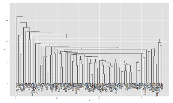
![Description: C:\Users\apple\AppData\Roaming\Tencent\Users\294055613\QQ\WinTemp\RichOle\SQHV0T`LM)4GG(A_}C]WZY4.jpg](Liyang%20Chen_files/image010.png)
As for the second graph, we can easily
discover that Big Stone, Grant, Norman, Red Lake, Marshall, etc
are the last few counties join the group, which just as we concluded before. Pennington and Kanabec
formed a cluster at the distance of 2; Morrison and Otter Tall merged to be cluster
at the distance of 2.2.Corresponding to the first graph, these two pairs of
groups are close enough.
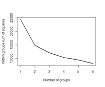
By carrying out the k
means, we find the elbow at 2. The counties which are at the edge of the first
graph are assigned to the first group and all the other counties which in the
cluster of the first graph are in
the group 2.